Blog

  • Process: Step 3 (final highlights)

    The last step utilizes the top layer to create the finishing highlights and details. Keep in mind that painting over the drawing will cover lines and texture. It’s perfect for achieving highlights and areas that need to really pop out. Really only a few touches, but it usually makes a world of difference.
    Since most of my color work lies underneath the drawing, the top layer looks something like this:

    And here’s the final:
    So that’s it. My process. So far.
    I’m sure (and hope) that it will continue to change and evolve. This weekend I think I’m going to play around with other ways of achieving line besides the pencil. Scratchboard and maybe even some woodcutting…

  • Process: Step 2 (color foundation)

    Now that I have my pencil layer complete, I need to make one final step in setting up the document for color. If needed, I make sure the image size matches the output resolution requirement for printing (usually I have to scale down a bit), keeping in mind any bleed areas. The document is not flattened so that I can manipulate the pencil drawing. I then add two new layers to the document around the pencil image, one below and one above. Then the pencil layer is set to multiply so that color from the bottom layer can be seen through. At this point, there are many things that can be done to the pencil layer to add some texture. Noise can be added, but I’ve stopped doing that, because as long as you scan the drawing in color at a high enough resolution, you get nice texture from the paper grain. Nicolas also toned his pencil layer with sepia (Image/Adjustments/Hue-Saturation, then check the colorize button), which I’ve also played around with and don’t really have an opinion either way. It comes down to an aesthetic choice.

    Laying down the foundation color:
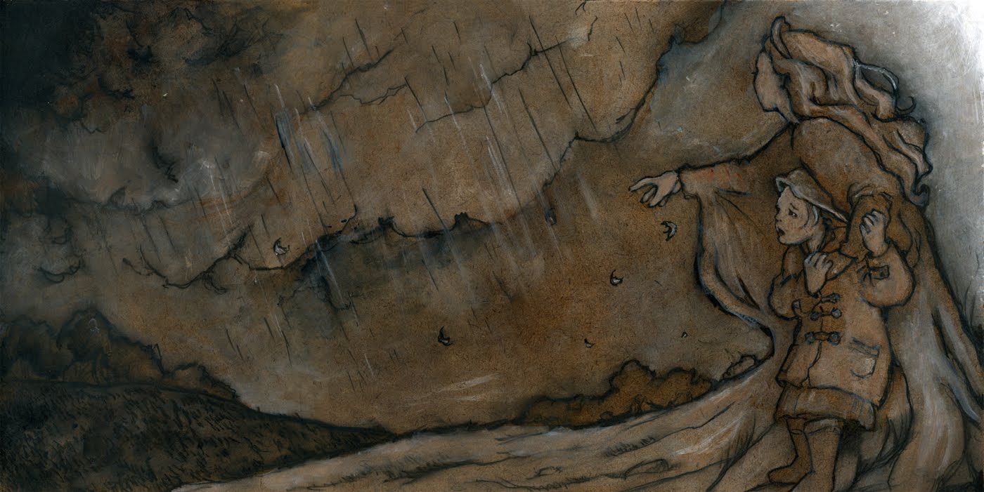
    On the bottom layer, I paint bucket the entire canvas with a warm ochre/sepia of my choosing so I can work on top of that rather than white. Something about a rich warm tone stimulates my imagination better that a blank white surface. It also gives my final palette unity, even if there is no visible sepia in the finished image.

    After this foundation color is applied, I start laying in the colors in broad strokes with the paintbrush tool (I play around with different textures of brushes), and working background to foreground, laying in horizon and sky color first. Then, still in the bottom layer, I continue to add more color detail, shading and highlight to each object. I like most of my color to rest in this bottom layer so that the grain of the pencil layer can add texture. This is what the bottom layer looks like in this image:

    One final step before the drawing is complete!

  • Process: Step 1 (a+b)

    a) I start the old fashioned way: just pencil to paper. I draw and draw and draw until I get it the way I want it. I don’t even think about color or texure. Just line and composition at this point. In the end I have something like this. This is definately the hardest and most difficult part of the process because it is the foundation from where everything else stems. If this doesn’t work, nothing else will.

    b) I then scan in the image into Photoshop @ at least 300 dpi, sometimes up to 600 dpi – the higher the resolution, the more depth of texture is picked up. I like to work big, so scanning on a typical scanner bed is tricky:

    First I scan in sections, therefore have maybe 3 or 4 scanned files to start with, making sure there is some overlap for matching the layers together. One of the files is chosen to serve as the final. I then create a copy of that background image, and delete the original background image. Next I increase the canvas size, so that the image floats above the empty grid and is free to be manipulated. I then take one of the other files and copy/paste into this “final” file as a separate layer. I play around with the opacity of the top layer against the bottom (it doesn’t matter which is which) so that I can see both layers. This allows me to allign the overlapping areas perfectly. This does take time. Not only do I have to move up and down, but sometimes I may have to slightly rotate one of the images as well. Once it is alligned, I reset the top layer to 100% opacity. There usually is a visible edge to the top layer. So I then take the eraser tool (set around 50%) and brush that hard edge away. Then, the top layer gets merged down. Each of the other files gets pasted and merged into this file in the same manner, one at a time.
    The result is one clean file of the original drawing, all layers merged, but not flattened (save as psd format) I may do a final clean up of any stray or unwanted marks from the scanner bed or the original.
    More to come….

  • My Illustration Process

    My Illustration Process

    Ok, before I go any further I must step back a bit and talk about process. My process came about due to necessity rather than by an artistic decision. I was asked to illustrate a book while I was in the midst of moving. And I had a two year old. So I really didn’t want to dive into alot of materials that would be smelly, messy, and potentially eaten or destroyed by curious little hands. Not to mention there was little living space to provide for any fancy studio set-up, and the living space I did have was slowly being taken up my moving boxes.

    So I started looking into how the computer could work for me. It seemed like the best solution to my circumstance. It’s clean. There’s no long set-up time. I can leave a file open and come and go all day, working for five minutes at a time if need be, in the middle of mommy-hood duties. I contemplated over using the computer for the work. The purist that I am kept accusing me of cheating. But I came to realize that the final product is a digital file anyway. This is not art that will hang in a gallery or on someone’s walls. It is MEANT to be viewed in reproduction, as essentially a digital image. This way, I actually have more control over the final product, instead of sending off priceless hours of original work, then hoping the production photographer/scanner will do justice to the colors. I still agonize over color, but that’s another story.

    I came across a wonderful find: “Illustrations with Photoshop: A Designer’s Notebook” published by O’Reilly Media. Documented by fantastic collection of illustrators, this compilation of journals was my answer (and still is). I have adopted (and adapted somewhat) the technique used by Nicolas Fructus. You can find his journal of the process in the book on page 39, I’ll give you my version here. To be continued….

  • Hello world!

    Welcome to WordPress. This is your first post. Edit or delete it, then start blogging!

  • Line

    I’m starting to think like a pop-up book. Line defining space rather than mass. Here’s a preliminary practice work for an illustration of the first paragraph of “Alice in Wonderland.” This is Alice. I want to create a world that is 2D and 3D at the same time. Flat figures and objects arranged in 3 planes: simply foreground, middle ground, and backdrop. Maybe that’s my theatre history emerging in my work. Downstage, Upstage, Centerstage, fly systems. I suppose we all have to draw from what we know and how we are used to seeing the world.

    This is only Alice. The vision can’t be realized until she is put in context with the environment, but I need to start practicing a new treatment of figures and objects, so I’m working on creating a dominant line defining the space around the object/figure, lines within always serving this ruling line, and washing out some saturation of my usual treatment of color. We’ll see where it leads me.

    To be continued…

  • Mama Earth

    There are times the wind blows too hard,

    Tossing trees and roofs.

    And there are times when the rain is too hard,

    Flooding rivers and towns.

    Until Mama Earth quiets the wind.

    Until Mama Earth stops the rain

    And dries the land.
    Illustration Intensive at the SCBWI Carolinas conference. We recieved the text on Tuesday, arrived on Friday with our preliminary sketch, then David Diaz took us through his process of execution. Layer of acrylic color on masonite board, then our sketch transferred with soft pencil and charcoal. We utilized the charcoal by smudging the entire drawing, adding depth and texture. Finished up with the detail work in more acrylics.
  • Buckle

    1-2 buckle my shoe
    3-4 shut the door
    5-6 pick up sticks
    7-8 lay them straight
    9-10 a big fat hen
    11-12 dig and delve
    13-14 maids a courting
    15-16 maids in the kitchen
    17-18 maids in waiting
    19-20 my plate’s empty

  • Launch

    ready .
    set . .
    go . . .

    illustration friday has launched me into my portfolio once more. this is where i live. the outer edge of the final countdown. before launch, there is a breathless, eternal second when anything is possible.

  • Hills

    “From the pleasant town of Maienfeld a footpath leads up through shady green pastures to the foot of the high peaks that gaze down solemnly and majestically on the valley below. Anyone who sets out in the path will soon catch the keen fragrance of low mountain herbs and grasses, for the footpath rises straight and steep to the Alps.”
    -Johanna Spyri, from Heidi