We’ve been talking a lot about personal space this year….6 feet apart, quarantine, masks, face shields. How physically close do we need to be to feel connected? How much physical distance does it take before we start feeling alone and isolated?
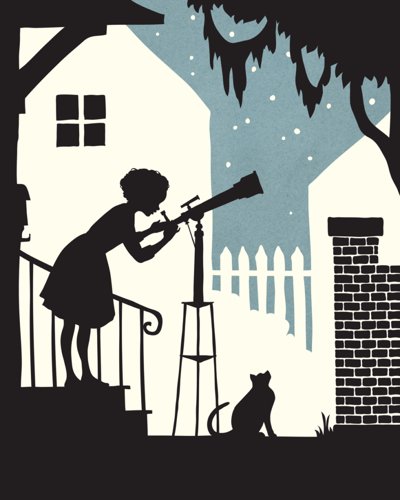
It’s kind of fitting this piece is called “Space.” A silhouette drawing is mainly about space. The positive space, the negative space, how our brains sort out that space when color is added as a third component to the black and white. Whenever I create any illustration I think of the space in terms of threes (fore-ground, middle-ground, back-ground). These elements are primarily connected to my roots in the theatre (downstage, centerstage, upstage). I think of prosceniums, layers of objects lying in space like a pop-up book, giving us the illusion of distance, when we do not have the reality of that distance.
When silhouetting in only black (using the white space as the negative space) there is only upstage and downstage – no middle-ground, or centerstage. It is only about the subjects, the action. But in adding a third color, you can add a third space.
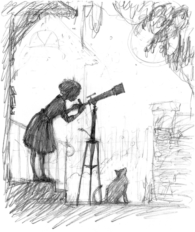
1. Black/darkest color should always be the foreground – the main subject, and where the action lies. I start here first with a sketch:
“Space” preliminary sketch – pencil on multipurpose printer paper. This was created quickly in one sitting (about 30 min)
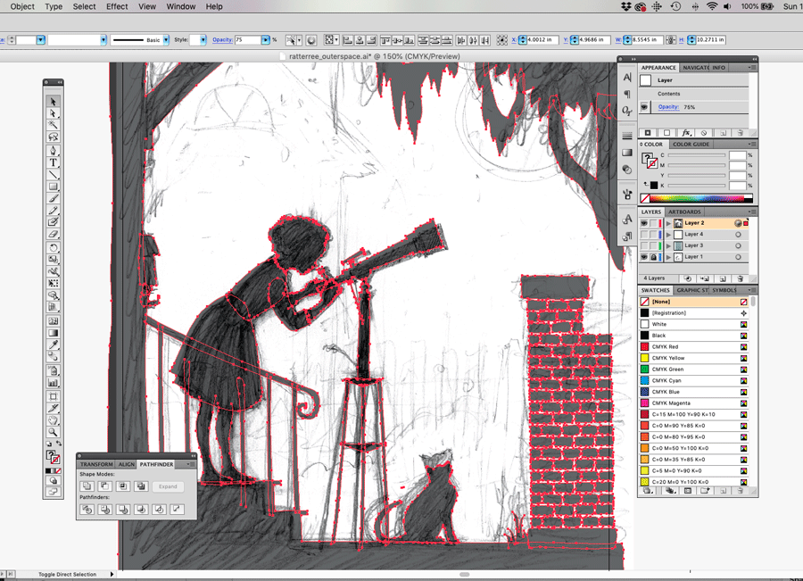
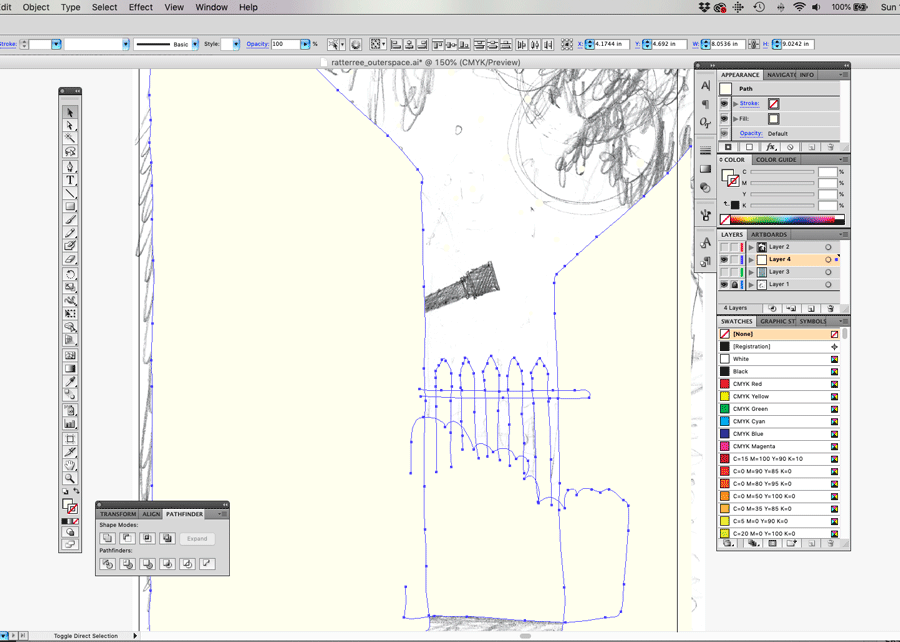
2. While I had a general idea of the middle and background information, I needed to first formalize the main drawing first. I achieved the smooth solid black color by importing into Adobe Illustrator and tracing my sketch as solid objects:
Setting the opacity to about 75% helps when tracing in illustrator. During this phase I am still making modifications to the original drawing (such as the size of the cat, the tilt of the telescope, etc.)
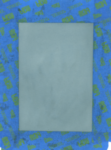
3. Once I have the main drawing set, I start adding the space behind her. Beginning with the farthest distance first, which I knew I wanted to be a deep blue color (but it couldn’t be too deep and compete with the silhouette). I had a small swatch of watercolor-painted paper in my studio that I scanned (I like to keep a few of these on hand in my work space. You never know when they will come in handy!)
(Here’s a snapshot of the scanned watercolor wash I used as the background night sky layer)
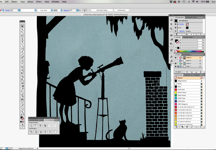
I am now able to abandon the sketch and advance the drawing within Illustrator. But at this point, it still doesn’t tell enough of a story. It needs more environment and atmosphere, and therefore I need to add in another layer of space using white. This gets tricky since in silhouette, white recedes, but since this is a night image, reversing this concept could help communicate the time of day.
4. I return to my original drawing layer and work only on the middleground as a new layer (I disable the other layers so I can focus only on the houses)
Toning down the starkness of the white helped me not only to see what I was doing, but it also softens the final image.
5. The final touch: adding the window was the final element that brought it all together. Even though the squares are black (like the fore-ground) they still seem to recede and stay a part of the middle-ground. Don’t ask me the science behind that – there certainly are others much more qualified than I who can explain it, but I’ll use it.
Have fun playing around with color this week, and discovering how it creates space. Share your experience with me on Instagram by tagging @aliceratterree
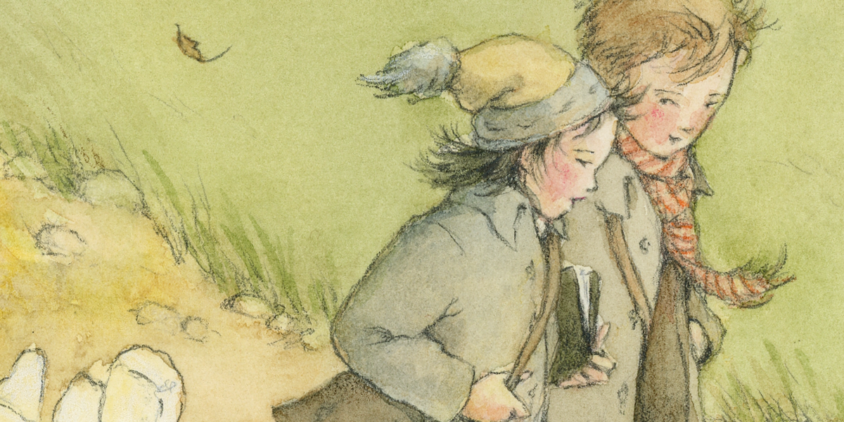
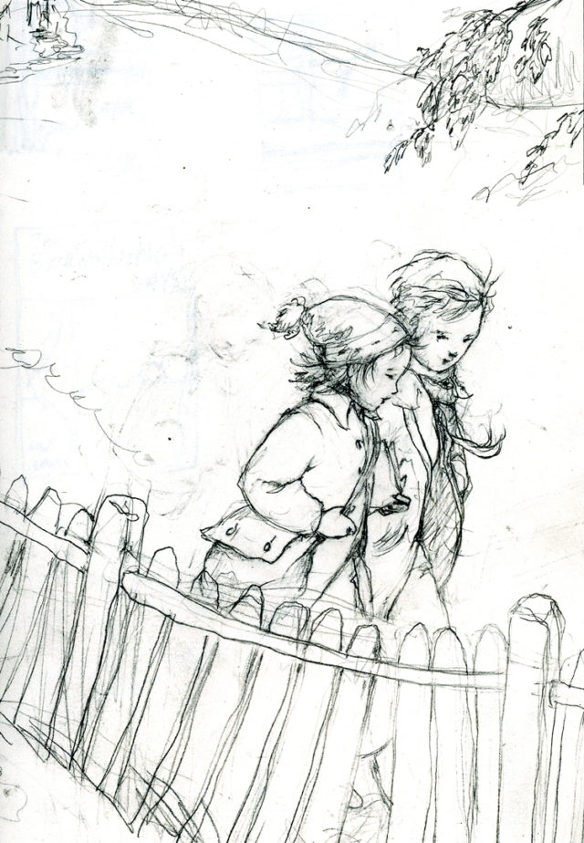
The idea of students walking to school probably brings into mind the old cliché stories of our grandparents – “When I was your age, I used to walk 5 miles to school in the snow!” (That gap between home and school proudly growing larger each time the tale is delivered) We may also regard walking to school as something archaic and “old fashioned” (imagine Laura and Mary Ingles trotting down a sun-dappled dirt path swinging books neatly buckled with a leather strap).
I myself never walked to school. Carpooling in a large station wagon was how my friends and I got around. Then about ten years ago I moved to Greenville to a neighborhood with an elementary school nestled only two blocks away. On the first day of my son’s first grade year, we walked.
We saw a bunny.
We listened to birds.
Watched the way the leaves changed color throughout the year.
We talked to other kids, other parents.
Strangers became friends.
My children are older now, but I still see others buddying up and walking up that hill, their crowns sweetly tilted inward as they talk. I’m confident they will have much better stories to tell about walking to school when they are grandparents.
Happy Earth Day.
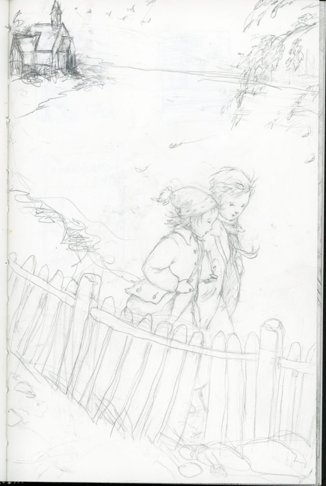
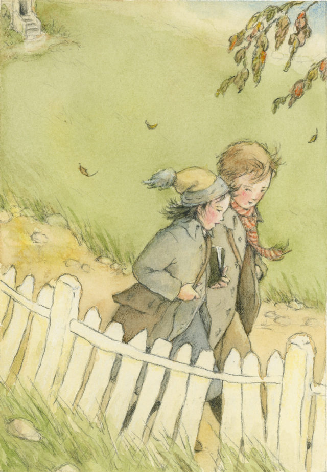
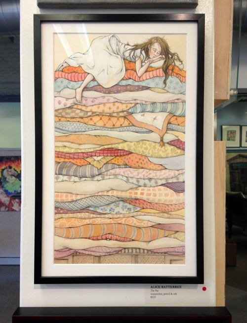
In this painting, I drew inspiration from this life memory….it starts with the sketchbook:
Sketchbook page (Usually worked on in the carpool line of my daughter’s after-school program)The sketch is scanned and cropped, then levels intensified (in Photoshop) for better visibility when transferring. I then print this out.
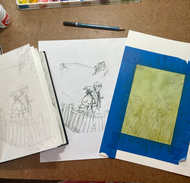
I use an Artograph Light Pad I bought from Michaels (if you pay attention to the coupon savings, you can get these for half the cost!) Place the printed copy of the sketch onto the light pad, and watercolor paper on top. Then trace for a fresh drawing. (Side note: I love listening to podcasts during this phase. One of my very favorites: 99% invisible from Radiotopia. If you haven’t heard of it, carve out 20 minutes today to start enjoying. Hours of discovery awaits you! You can also browse other amazing Radiotopia shows like Criminal, and The Truth)
The art table at a glance…
The process… *note: the watercolor paper washed in green was a first pass/practice on a monochrome surface (I usually keep test washes laying around and draw/paint on top of them for fun) I repeated the process with a clean piece of watercolor paper and added color (see final below)
Then begins the really fun part: bringing it to life with more definition and color….
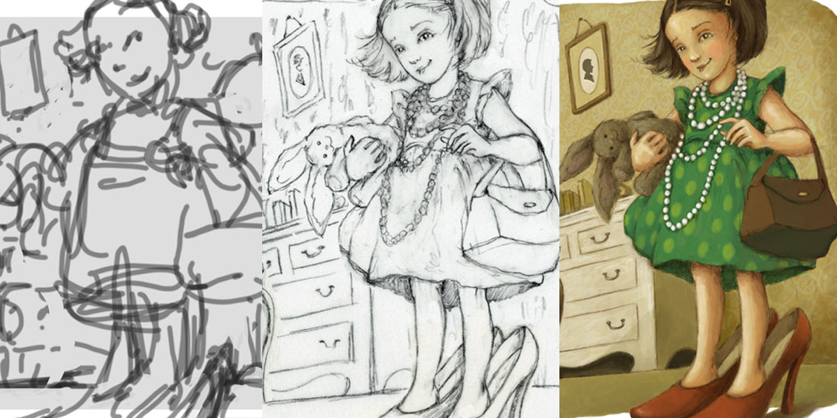
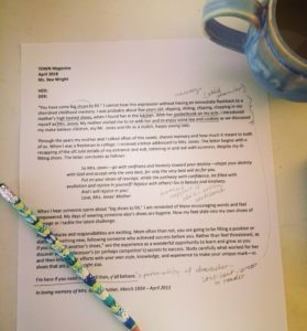
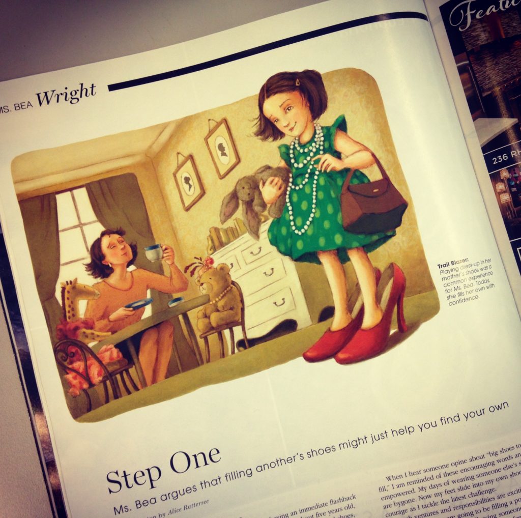
Steps to making an illustration. (The following example was created for TOWN magazine)
1) receive manuscript. Your first job as an illustrator is to READ! (and take notes)
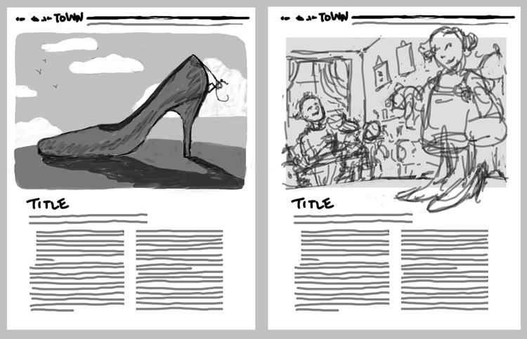
2. sketch concept ideas (this was an editorial work, so I worked on the sketch digitally in Photoshop using brush tool, within the pre-determined layout of the page)
concept ideas
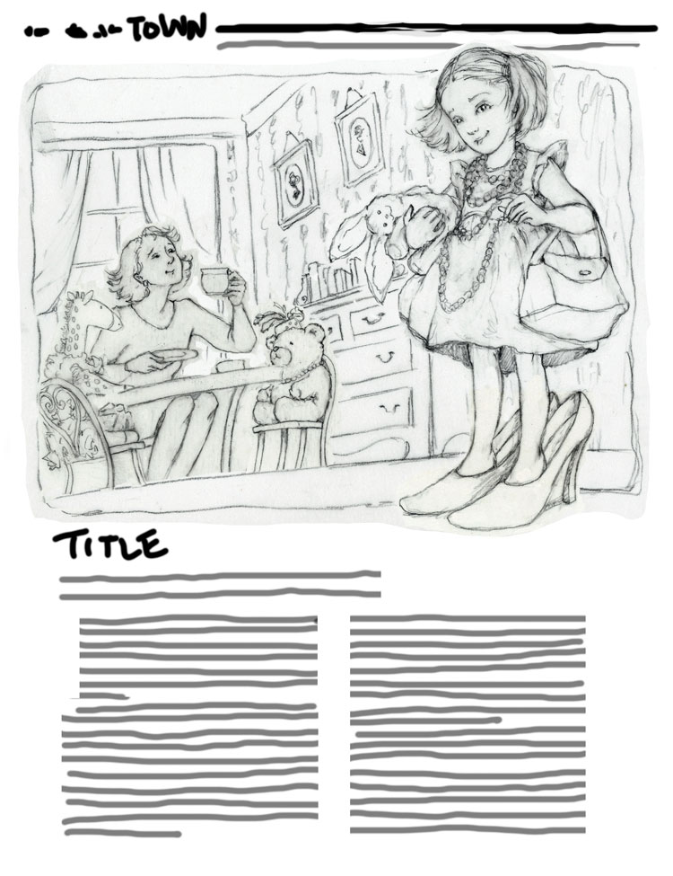
3. after determining which concept to follow (in this case, I chose #2 – it was the more difficult path and I always love a challenge!), finalize detail and clean up the drawing….
final drawing before painting
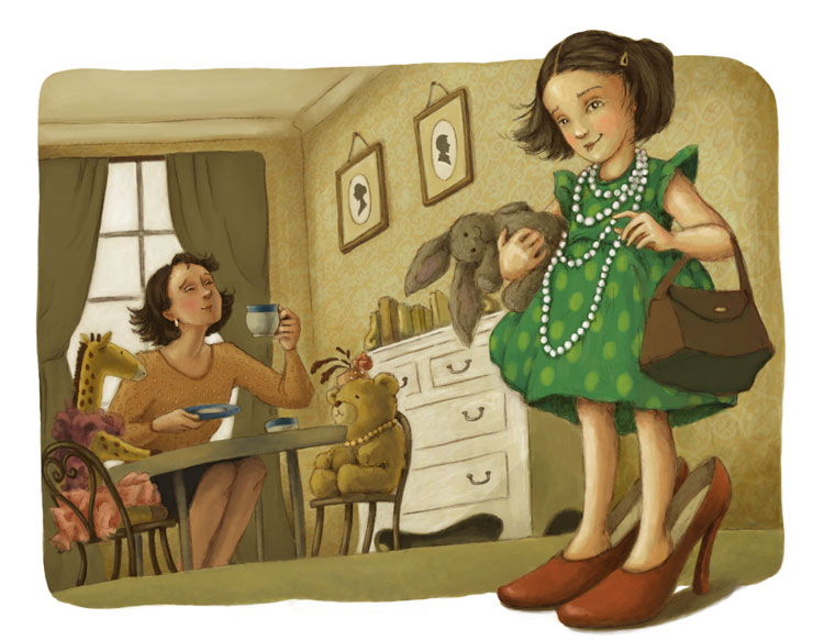
4. painting (the fun part!) This piece was painted in Photoshop using various art brushes.
final art
5. And lastly, enjoying that sparkly happy feeling when you finally hold it in your hands!
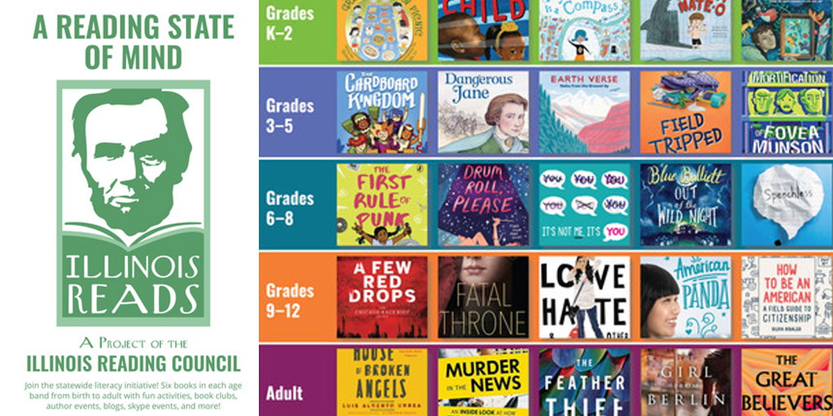
Dangerous Janehas been selected for the 2019 IllinoisReads program in the grades 3-5 category! Sponsored by the IllinoisReading Council, this program is a yearly statewide project aimed to encourage Illinoisans to read books by Illinois authors. Congratulations, Suzanne Slade!
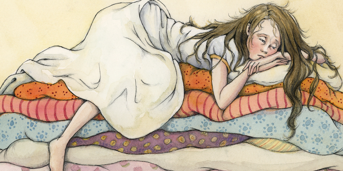
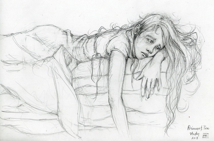
I recently posted about illustrating nonfiction and the use of reference and historical photos during the process, but what about fiction? It is still just as vital to use live reference when illustrating a work of fiction. Illustrations don’t necessarily have to be “right”, they just have to be believable. But in order for them to be believable, they must be based in life reference. I can’t get inspired about making a drawing unless I have something from life to set my imagination into flight. Achieving this balance between reality and imagination can sometimes grueling and time consuming, but it is the part of the process I love most.
But while they were successful life studies, I still wasn’t happy them. They all just looked like a portrait of a sad girl and didn’t speak the language of children’s book to me. Here, the character doesn’t embody the right emotion and the pose is missing the element of humor and charm needed to really communicate.
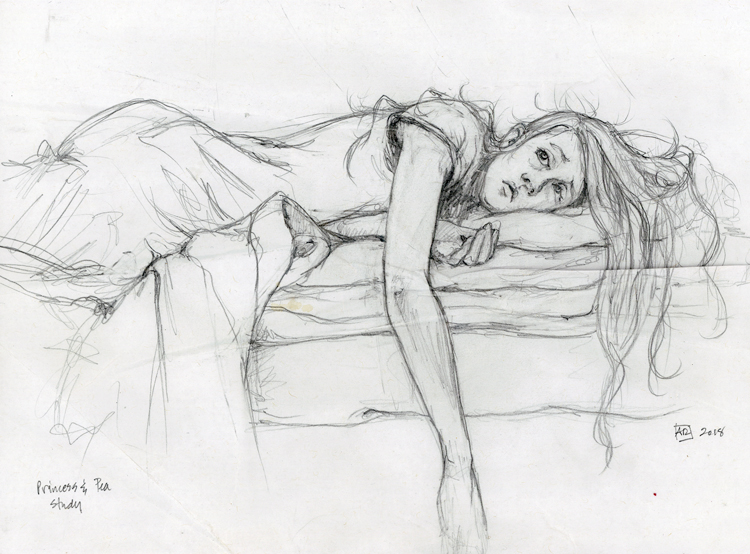
After this, I put all my photos away, and drew from my imagination, fueled by the memory and experience of drawing the life studies:
Drawing from imagination with life reference
It finally felt as though I had achieved the right balance of my own personal storytelling, mixed together with information gathered from the studies from a live model. This final drawing couldn’t have been achieved without the initial studies.
The rest is smooth sailing. Flesh out the remainder of the composition (I use Photoshop and draw using brush tool the remainder of my idea):
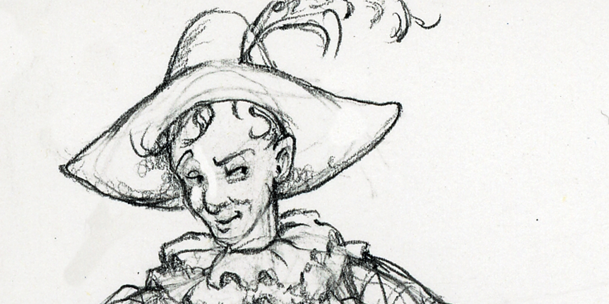
Diving into Commedia dell’arte character studies…Harlequin, or Arlecchino (Italian) was a very popular stock character in the zanni category. Zanni were typically a pair of servants to an upperclass couple. Arlecchino is known for his wit, physical agility and a cunning ability to outsmart his master.
If you are into girl power, then it doesn’t get any better than Jane Addams. I shamefully admit that I knew very little of this renegade change agent before author Suzanne Slade’s manuscript, Dangerous Jane (2017, Peachtree Publishers), landed in my studio, and I will forever be thankful she has come into my life.
For those of you who are trying to dig through memories of high school history class, Jane is widely considered the “mother” of social work. Born in 1860, Jane grew up in a family was of substantial means and social status (her father John Huy Addams was a successful businessman and active republican party senator, sharing a personal friendship with Abraham Lincoln). Yet despite living during a time when women were expected to politely follow a traditional path, Jane brushed off these conventional ideas to blaze a trail of her own in social reform, founding Hull House with Ellen Starr in Chicago in 1889 – our nation’s first ever settlement house. As if that’s not enough of a life’s mission, she became the first female president of the National Conference of Social Work, was co-founder of the ACLU, established the National Federation of Settlements and served as president of the Women’s International League for Peace and Freedom. Oh and by the way, she also won a medal called the Nobel Peace Prize (the first girl in our country to achieve that)!
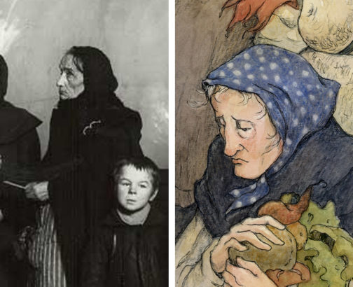
So when tasked with illustrating the account of this woman’s life, naturally I very much felt a sense of responsibility to honor her legacy. It was vital I do a lot of visual research of the real people and places to refer to. Thankfully there is an abundance of photography of the immigrant population at the time. In addition to social activists like Jane, the world of photography was experiencing a similar movement exposing the grittier aspects of society – tackling issues of poverty, child labor and other social injustices with dynamic an emotionally moving images.
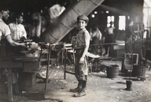
Boy in a glass factory (ca. 1890), Jacob A. Riis
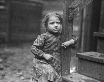
Tenement Child Near Hull House, Lewis Hine
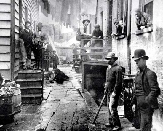
Bandit’s Roost, Mulberry Street (1888), Jacob Riis
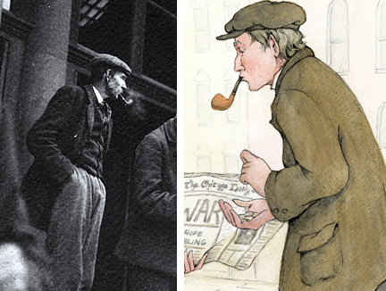
I pasted many of these characters up on my studio walls so I could just live with them throughout the process.
From this abundant pool of people I had the perfect “casting call.” Each time I found a person that spoke to me through these photographs, he/she would become a character in the book.
The same went for spaces. These dilapidated environments of Chicago’s poorest neighborhoods were helpful in creating the scene when Jane encountered poverty.
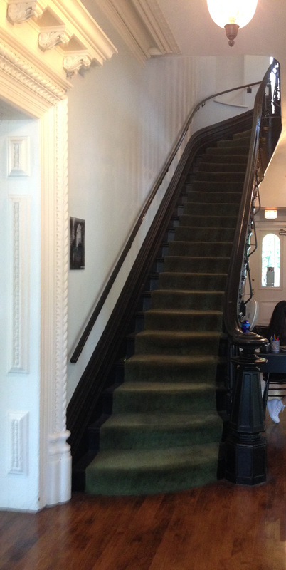
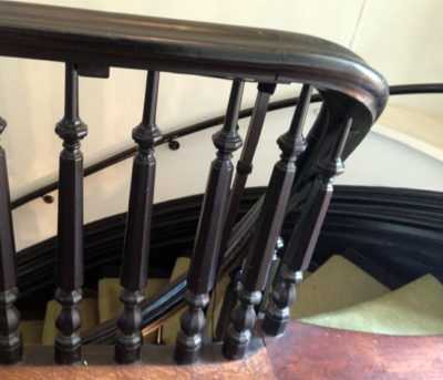
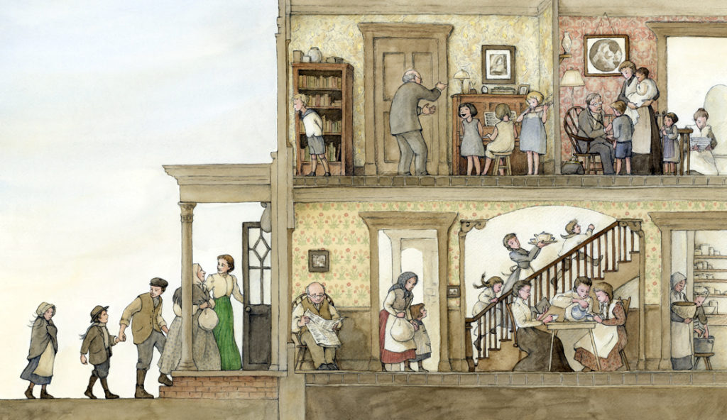
Depicting the Hull House seemed especially intimidating, mainly because this home still stands today as a museum on the campus of University of Illinois Chicago. So I made a point to visit the museum and walk the halls and grounds. Nothing ever conveys the feeling of what it’s like to physically be there, to hear the echoes in the halls or the sound of the old staircase as I walked up and down, the smell of the old wood, and the smallest details.
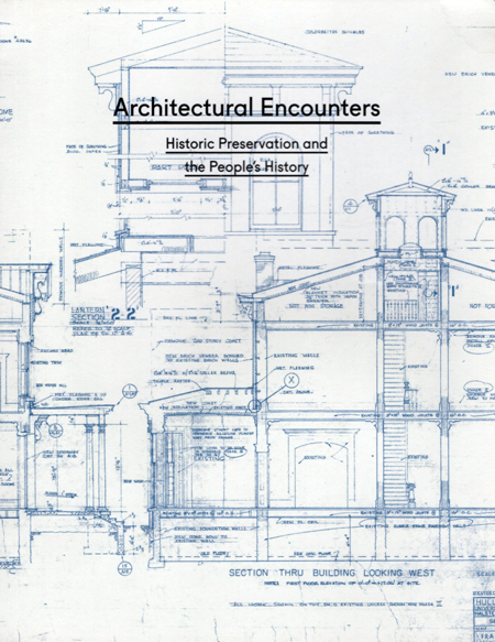
While I was at the Hull House museum gift shop, I encountered a book that immediately caught my attention – Architectural Encounters: Historic Preservation and the People’s History. The cover caught my eye with the blueprint renderings of the house and immediately me inspired to utilize this information into the Hull House spread.
I did not hesitate to pick up the book and buy it – just for the cover alone, but unfortunately the book didn’t offer all the angles and details I wanted. So I went in search of the original blueprints of the home through the university. UIC’s Office of Planning and Special Collections & University Archives were of great help – they were so gracious assisting me and providing me with an abundant supply of additional images! Here are just a few examples:
One of the most striking aspects to me was the beautiful wallpapers of William Morris that adorned many of the walls. Jane’s bedroom, lovingly preserved in its original state, was so striking with the its design by William Morris’ daughter, May Morris. This welcoming room convinced me that green should be her signature color throughout the book.
In fact, many of the Morris illustrations ended up serving as inspiration for the aesthetics and color palette of the book.
As I now take down the photos on my walls, I’m shocked at how melancholy it is to finish a book and have to move forward. You live with these characters and they become a part of your life for a brief intense time, then quietly and unceremoniously drift away. Like the way Richard Parker leaves Pi stranded on the beach in that beautiful novel, Life of Pi. But there is great comfort and pride in knowing they will go out into the world and live forever.
I’m so thankful to Peachtree Publishers, who believed in me, and to Suzanne Slade for her brave decision to shine a spotlight on this unsung hero – especially now, when our world desperately needs more Dangerous Janes. In honor of her release, I’ve asked Suzanne to share this blog with me by answering a few questions:
__________________
1) There aren’t many picture books out there about Jane Addams and so this will be the first time many young readers are introduced to this brave woman. What do you hope children will gain from learning about Jane’s life?
Surprisingly, there wasn’t a single picture book about Jane Addams when I began working on Dangerous Jane in 2013. Since then, only one picture book has released, The House That Jane Built, which shares how Jane co-founded Hull House.
Right from the start of this project, I knew I wanted to share Jane’s tireless fight for peace, in addition to her work at Hull House. I thought it was important to highlight her peace work because it seemed most young readers and adults didn’t know about her incredible contributions to world peace, and the fact that she was the first American woman to win the Nobel Peace Prize. I also wanted to share how she was harassed and rejected (and ironically named “the Most Dangerous Woman in America”) for simply helping people — all people in need. In Jane’s day (and unfortunately now), society treated people of certain backgrounds/religious beliefs as “less than,” but Jane knew every person was important and valuable. At Hull House she helped people from various backgrounds get along and respect one another, which strengthened her conviction that people from various nations around the world could successfully live in peace too. So to answer your question, my greatest hope is that Dangerous Jane will help readers realize that diversity and differences make the world a beautiful, exciting place, and that we should all do our best to live at peace with each other.
2) As a writer, there’s a certain amount of faith and “letting go” to hand over a manuscript to an illustrator. What quality(ies) do value most in an artist to bring your stories to life?
Actually, it’s never felt like “letting go” with any of my books. It feels more like a long-awaited “moving forward”, because up to that point the story has only been black and white words. So it’s always exciting when an illustrator joins the project to finally turn the words into a real book.
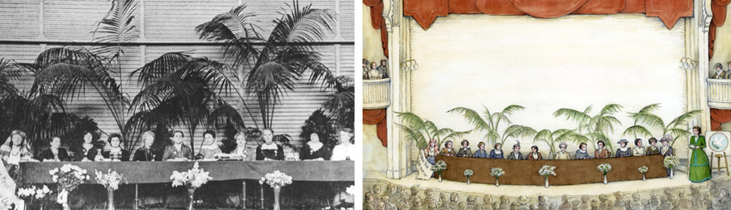
Since most of my books are nonfiction (except one so far), I value working with an illustrator who digs deep into research so that the illustrations not only bring color, life, and energy to the characters and story, but they also present the correct factual details. Speaking of which, I’m so grateful for the painstaking, in-depth research you did Alice! I can only imagine how daunting this process must have been with field trips, photo researching, interviews, etc. Your hard work and attention to detail is so evident in the scenery, clothing, hairstyles, Hull House rooms, and even the accurate newspaper headlines (and so much more!)
For example, it was so clever how you created the illustration of Jane leading the International Congress of Women in the Netherlands from a photo of that historic event in 1915. FYI, I’m still amazed by that gathering — 1500 women from 12 countries (both warring and neutral nations) worked together to come up with viable, practical ideas to end a war!
3) If Jane Addams invited any three people in history over for dinner, who would they be and why?
This is a really tough question, but I’ll attempt a few guesses. I wonder if Abraham Lincoln might be near the top of Jane’s dinner list. Lincoln was a friend of her father, John, and Jane recalled with great fondness in one of her books about the time her father shared his letter from Lincoln with her. Jane was only five when Lincoln died, so I imagine she’d enjoy chatting with Lincoln about the challenges he faced trying to bring peace during the Civil War, as well as reminisce about her beloved father.
Now if we’re talking about anytime in history, perhaps Jane might like to meet some brave women of the future — women who like Jane, weren’t be afraid to stand up for what they believed in as they worked for peace and helped struggling families. I imagine Jane would have a great time swapping stories and ideas with Malala Yousafzai, Madeleine Rees, Wangari Maathai, Ellen Johnson Sirleaf, Tawakkol Karman, or Leymah Gbowee to name a few.
(During Jane’s adventuresome life she met many remarkable people she admired, such as Leo Tolstoy, John Dewey, Alice Hamilton, women peace delegates from countries around the world, as well as prime ministers, presidents, and even the pope!)
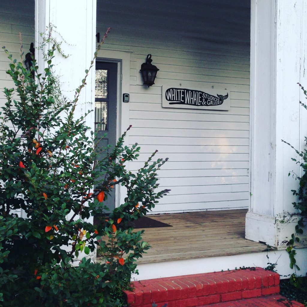
This weekend, many Greenville artists (including me!) will open their studios to the public for the Metropolitan Arts Council’s annual Open Studios event. You will be able to come visit our workspace, learn about our process and have the opportunity to buy local art. Please come visit me and painter Jacki Newell at White Whale Studios, 401 Smythe Street, Greenville, SC 29611!
2016 Open Studios Hours:
Friday, November 4th, 6-9 PM
Saturday, November 5th, 10 AM-6 PM
Sunday, November 6th, Noon-6 PM
White Whale Studios 401 Smythe Street Greenville, SC 29611
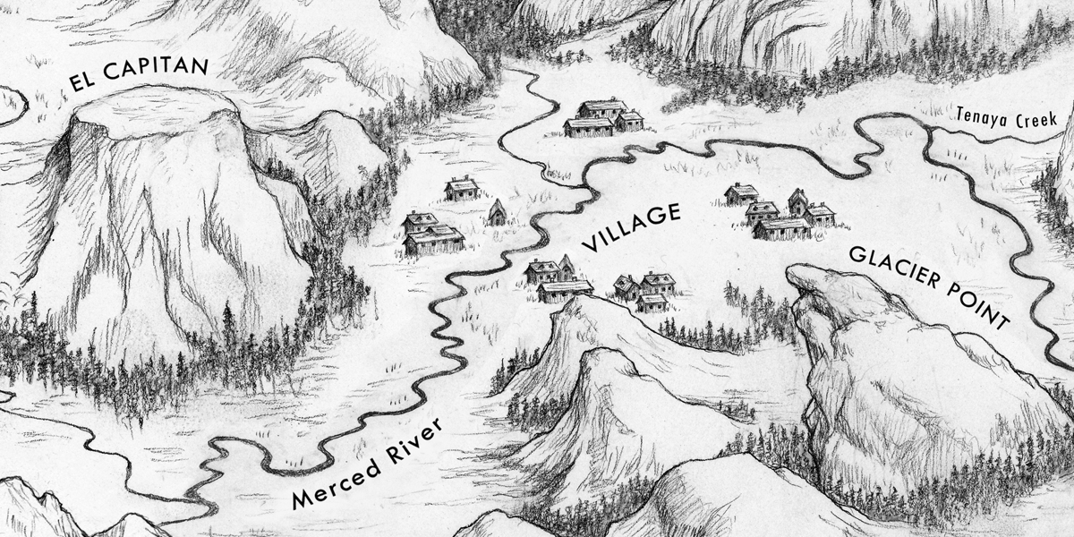
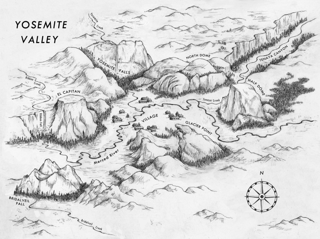
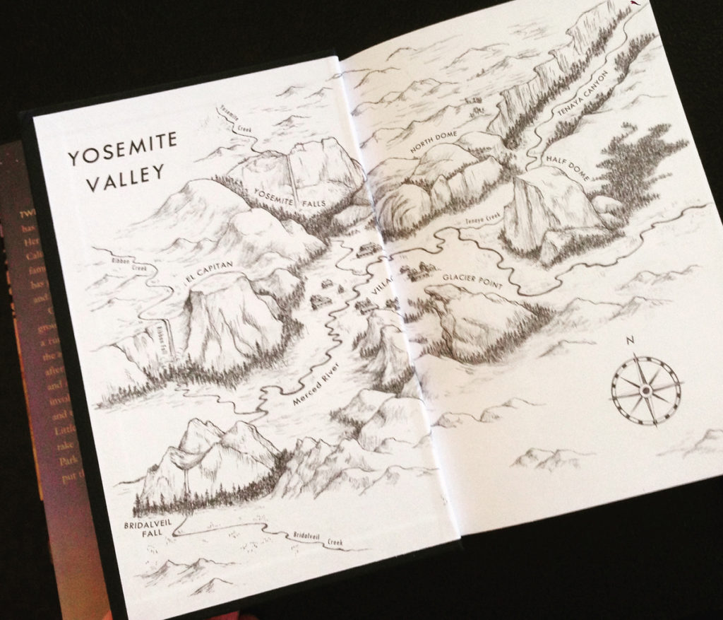
One of the most enjoyable moments I had bringing this book to life was creating the setting of Yosemite National Park. This was a vital element to the cover. In addition to representing Yosemite on the cover and in key moments of the story, we all agreed that a map of the valley – where Lizzie and Tyler experience their adventure – was definitely in order for the endpapers:
Illustrated Map of Yosemite Valley, The Wolf Keepers (Broach)
If you’d like to plan your visit to Yosemite or any national park, visit the Mountain IQ at https://www.mountainiq.com/. These two have done their homework and are a great resource to help you prepare for your next mountain experience.