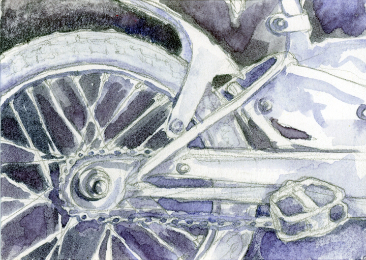
One of my favorite annual events is Metropolitan Arts Council‘s “Flat Out Under Pressure” (FOUP) contest. In its fifth year, this program intertwines visual arts and sound environmental practices in downtown Greenville. FOUP provides eight recycling bins for paper, plastic and glass in various locations along Main Street, encouraging recycling among pedestrians while creating a different exhibiting opportunity for visual artists.
The event, which took place this year at the end of June, begins with a 24-hour art-making juried competition. Each participant comes to the MAC office to have their surfaces officially stamped.
my stamped blank surface ready to go! 9:00 am, June 27, 2014
Artists may stamp as many surfaces as they like, but only one can return within 24 hours as an official submitted work of art. Once returned, the pieces are then juried that afternoon with an awards reception held in the evening. In addition to receiving cash prizes, selected winners have the opportunity to choose two images of their work for reproduction on the downtown recycling bins. 1st place winner even gets a week-long trip to Italy to stay in the beautiful Villa Sant’ Andrea! (Here’s to hoping for that one someday) The show is displayed in the MAC Gallery throughout the month of July.
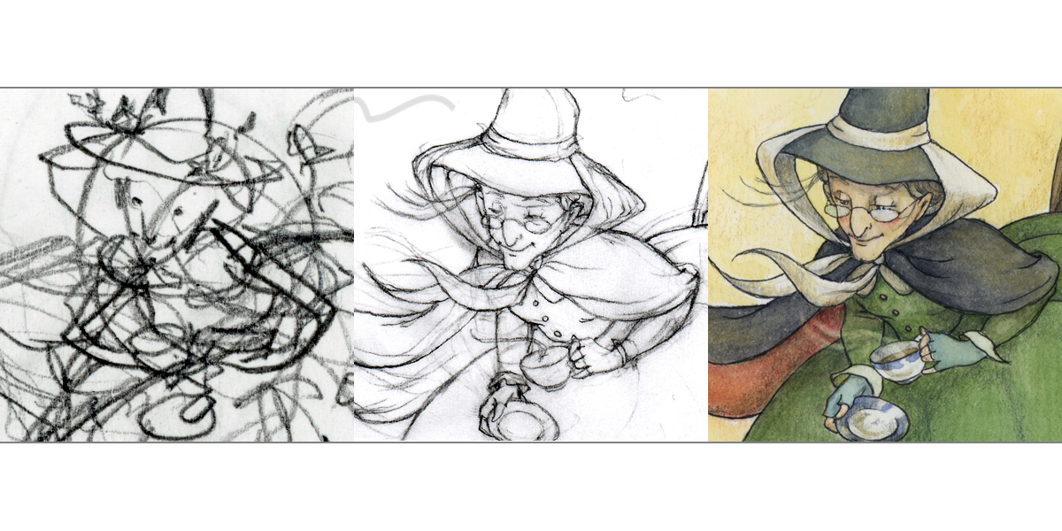
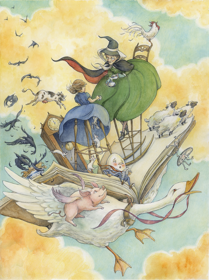
So for the process: How to prepare for having only 24 hours to create a finished work of art?
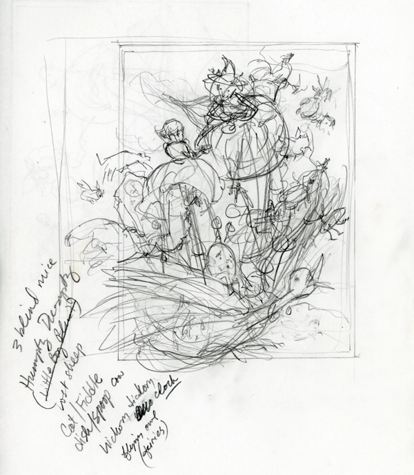
It began with a thumbnail:
mother goose brainstorming
To keep the energy of the thumbnail, I scanned imported to Photoshop and then increased size of the thumbnail which was roughly 6″ by about 7.5″ to fit the paper I would use, 12×16″ – so about a 200% increase.
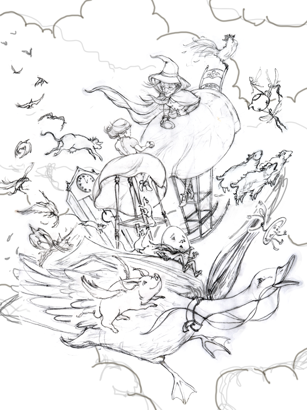
I then used tracing paper to trace the thumbnail and add detail…
adding detail from thumbnail using tracing paper
Since I didn’t have tracing paper that was 12×16″ each figure or group of figures was worked on separately. I then scanned them into Photoshop and added each image carefully over the original thumbnail file in a separate layer. The result was a “final” sketch compilation:
“final” sketch of compiled scans in Photoshop
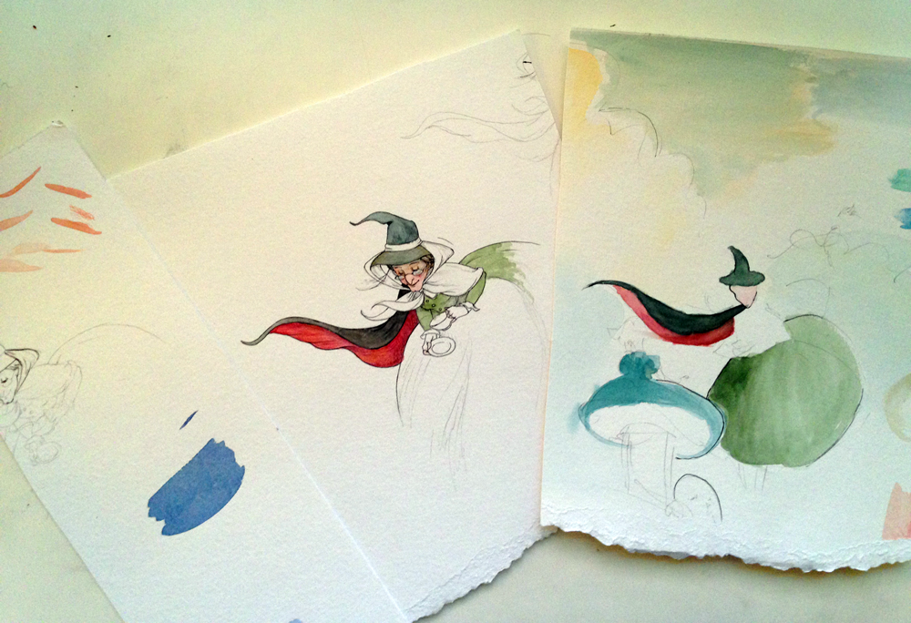
This was printed out to scale (took about 4 sheets of ltr paper, which I pasted together) All of this was prepped and ready to go before the event. The evening before the event I had fun transferring a few sections and working with the color palette.
color and line practice before the big event.
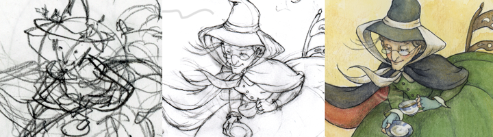
So once I had my surface stamped, I was able to promptly bring it home, and have a full 24 hours to transfer the sketch using a light box, ink and paint it. 24 hours goes by pretty fast even when you pull an all-nighter!
I usually like to feature an illustrator for every blog post, but today I have several. The following illustrators were selected for the annual SCBWI mentorship program. Take a moment to check out their amazing work!
A tribe, according to the Merriam-Webster Dictionary, can be defined as “a group of persons having a common character, occupation, or interest.” As illustrators, we are a lonely bunch of people. We wrestle in isolation with our visions, attempting (most of the time in vain) to harness them into reality. We have very personal (sometimes dysfunctional) relationships with our materials, work space and that beast called time. These often dominate our attention more than our family and friends. And while our non-artist family and friends support and care for us, do they really understand our madness?
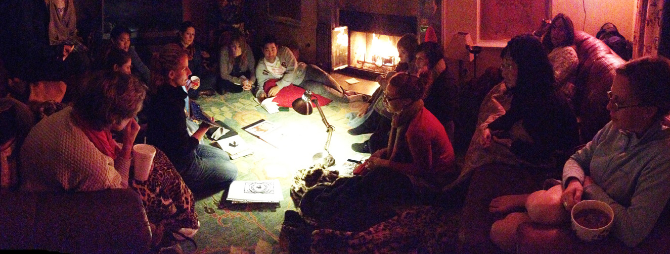
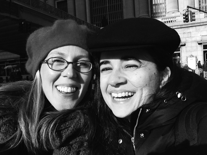
SCBWI is just that- a tribe. But it is a large tribe, so it is also beneficial to find a tribe within the tribe. Find a group of people to connect with on a regular basis to help propel you towards being the best artist you have the potential to be. And sometimes your tribe will find you, like mine did for me. While attending a regional conference in 2011, I met David Diaz, award-winning illustrator and SCBWI mentor. He invited me and Bonnie Adamson to what is known as “Lost Weekend,” a weekend that he hosts in his home for the SCBWI LA Mentorship Program recipients.
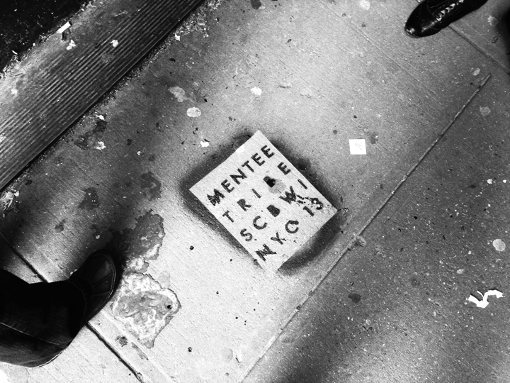
The Mentee Tribe (Photo by Maple Lam)
From there, the origins of the “Mentee Tribe” was born. This is what the tribe means to me: I’ve been illustrating children’s books professionally now for almost 4 years, and in that time I went from knowing close to nothing about the business of children’s book publishing to walking the streets of Manhattan with some of SCBWI’s finest award-winning illustrators to visit two first-rate publishing houses. And that was what Diaz’s “Mentee Monday” was all about – getting a glimpse behind Oz’s curtain.
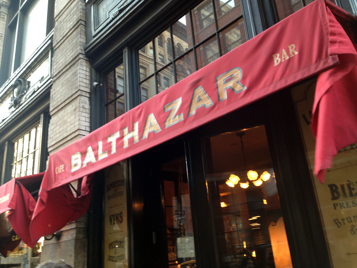
Balthazar hosts a scrumptious brunchcheck out the hazelnut waffles fellow illo pal Jessica Lanan had! (Photo by Lessica Lanan)
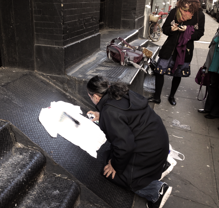
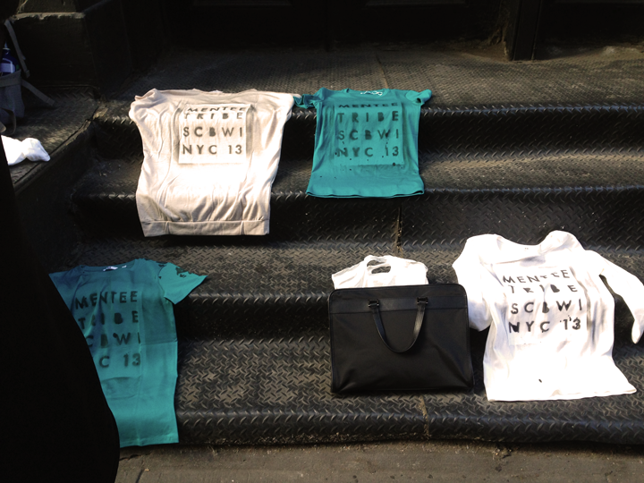
Before starting the rest of our day, our fearless leader, David Diaz had a little art project for us.
It wouldn’t be New York without a little live street art, would it? Mentee Tribe Leader David Diaz works his magicThe final productMentee Tribe Was Here.
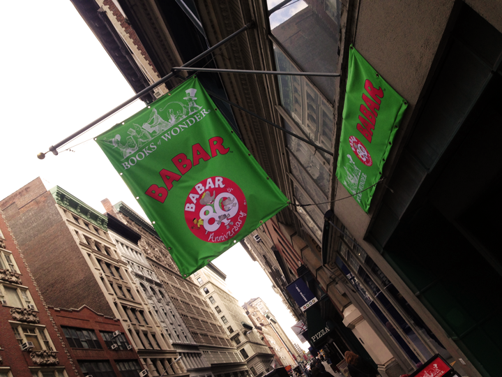
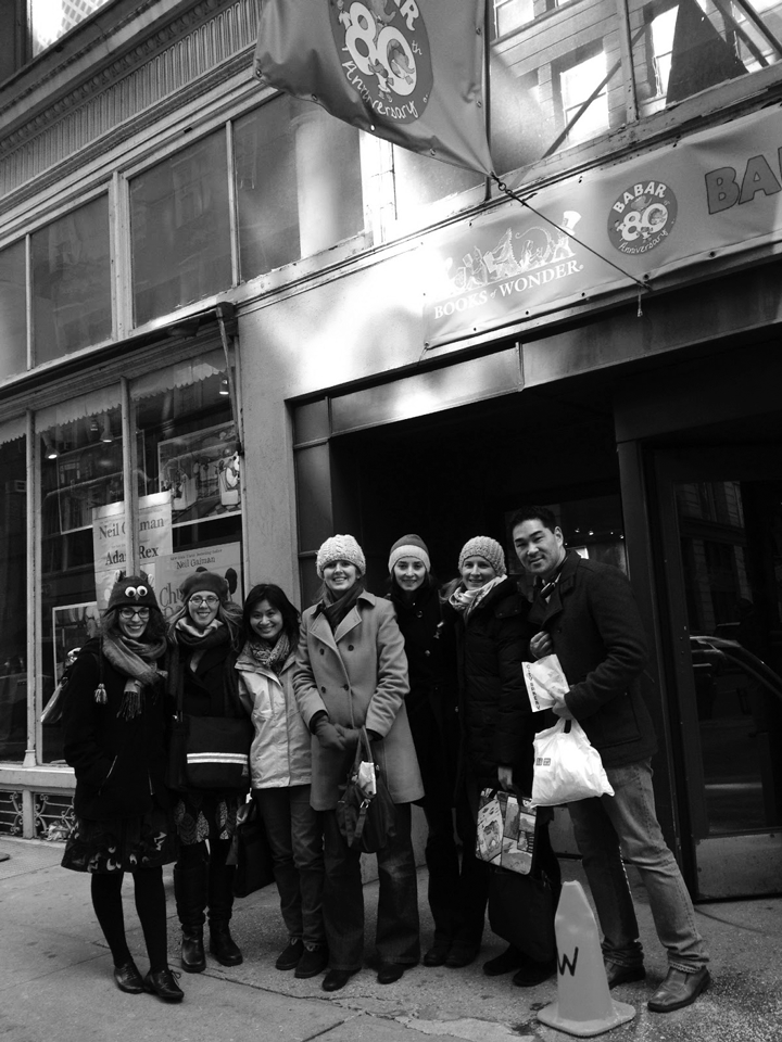
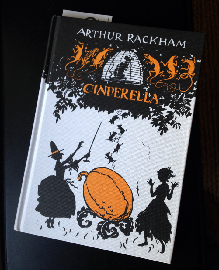
Then it was off to Books of Wonder where there were indeed books full of wonder, like Rackham’s Cinderella, which of course I snagged for more silhouette inspiration….
Books of Wonder, the city’s leading specialist in children’s literature (another note: Books of Wonder is one of the last remaining independent bookstores)The mentee gang outside Books of Wonder (Photo by David Diaz)Cinderella, Arthur Rackham
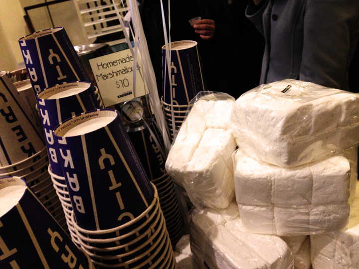
We then sported the subway to head over to Abrams, our first publisher stop, but not before sampling the chili-laced hot chocolate, thick as maple syrup, at City Bakery, where you can also find homemade marshmallows.
City Bakery, home of the richest hot chocolate you will ever taste and homemade marshmallows!
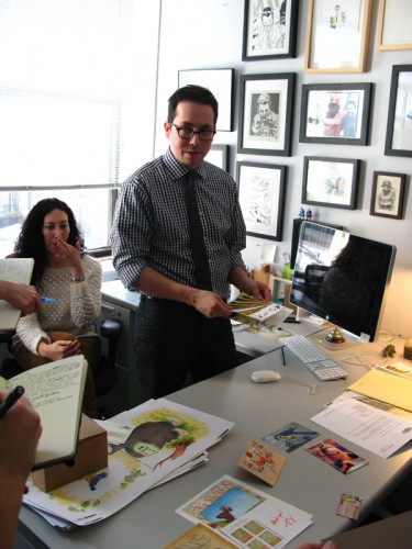
At Abrams we were warmly greeted by Editorial Director Tamar Brazis, who introduced us to Creative Director Chad Beckerman and Associate Art Director Maria Middleton. They all spoke about how they find illustrators and what makes them want to work with an illustrator. The team seemed to indicate that all they need to see can be found on a simple postcard. The key however is to have a postcard that moves them to put it up on the bulletin board. Chad’s biggest requirement is an illustration that evokes strong emotion in the viewer. In the end, we all had the privilege of handing our own postcards to each of them in person, with the hopes that they find their way to the bulletin board!
Tamar Brazis and Chad Beckerman of Abrams discuss what it takes to get noticed by art directors. (Photo by Jessica Lanan)The Tribe enjoys a tour at Abrams (Photo by David Diaz)
Next stop, Penguin Young Readers!
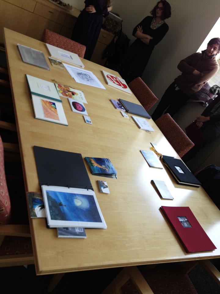
The Penguin PortalThe Mentees offer portfolios at Penguin
Upon arrival at Penguin, we drop off our portfolios for Art Directors viewing. We are then escorted by Cecilia Yung, VP and Art Director, to a conference room where we meet representatives from Grosset & Dunlap/Price Stern Sloan, Dial Book for Young Readers, and Philomel Books, which are all additional imprints of Penguin. We quickly get the picture that Penguin is a factory! Each representative describes the types of books they produce and provides examples of artwork appropriate for each imprint. Before we take a tour, we are offered each a current catalogue of new releases by Penguin and its various imprints!
Penguin looks like most large offices, lots of cardboard and lots of cubicles. The only difference here is you find Caldecott award winning art displayed on the walls, and then you remember that you’re not in Kansas anymore! My absolute favorite part of this tour was visiting the color correction room, a small room filled edge to edge with a large slanted table. Above the table sits a panel of specially balanced light (perfect mix of warm and cool tones) carefully installed at the precise angle on the table below. The color correcting stage of book publishing can be a tedious and lengthy back and forth process between illustrator, art director and printer. It was thrilling to discover this is where Cecilia Yung’s passion lies. She informed us that even long after the illustrator is satisfied with color, she will still arrive early in the morning to discuss color with a printer in China. So you can take comfort knowing that your artwork lies in the committed and capable hands like the pros at Penguin!
Before picking up our portfolios, we stop for what is called a “sunset alert.” Well, with windows like these, you can see why…
The “Sunset Alert”, from Penguin Group
Other highlights from the weekend include:
1. Getting to catch up after SEVEN years with my old Beantown pal, Heidi Hendricks (Who is now an SCBWI member! A great addition to the organization, I must say)
with writer Heidi Hendricks
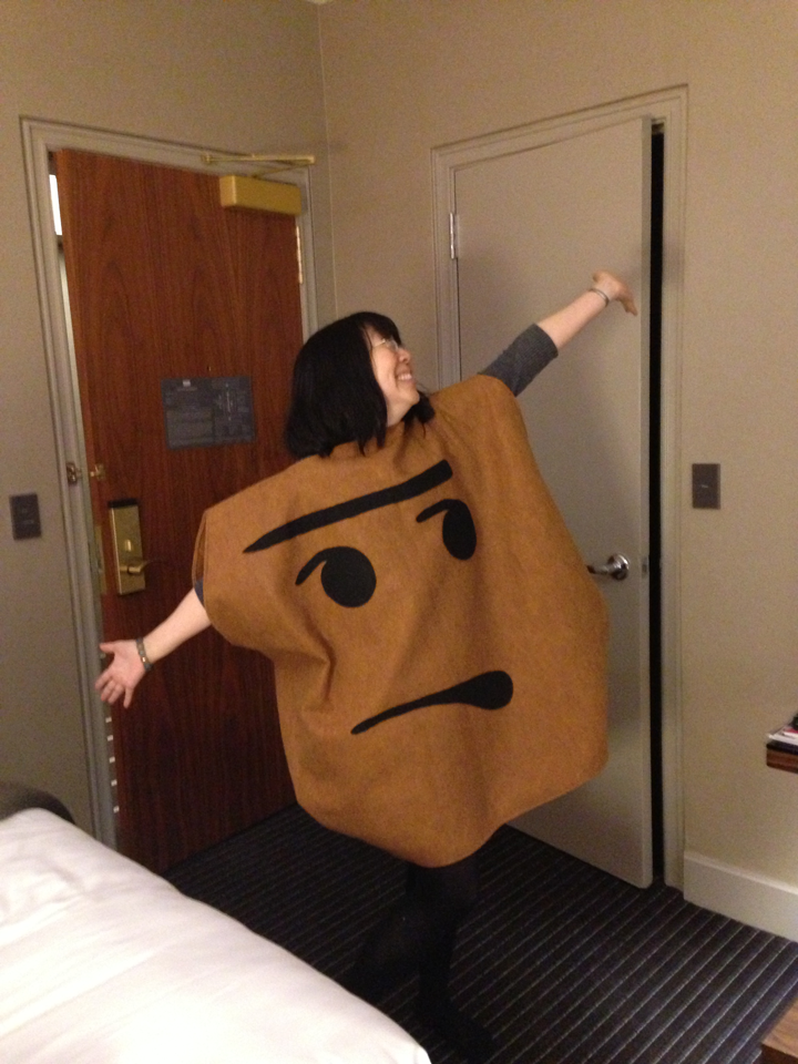
2. Writer/illustrator/fellow Mentee tribe member Debbie Ohi dons her new potato wardrobe designed by Simon & Schuster, in honor of her releaseI’m Bored
Debbie Ohi as “the potato”
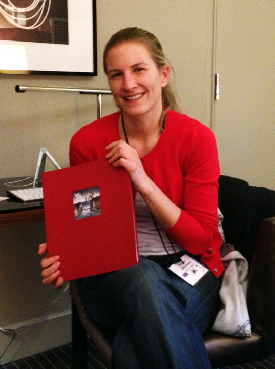
3. Fellow Mentee Tribe member Andrea Offermann wins the portfolio showcase!
Andrea Offermann and her winning portfolio
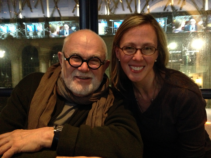
4. Meeting and talking silhouette art with artist Tomie dePaola!
with Tomie dePaola
In the end, I learned that there’s a place for everyone in this industry. That there’s always more than one way to illustrate a book. That there are no wrong questions. That sometimes illustrating is more about ideas than just good technique. That a tribe is important. That we all wrestle with the same barriers. That we’re all in this together!
Visit the Mentee Tribe member pages and read other recaps about Mentee Monday on these websites:
Alice Ratterree’s cut out silhouette stood out. I liked that she secretly added a pair of scissors on one side and a profile of Mark Twain on the other…(more) • Tomie dePaola
I couldn’t be more thrilled to be given this special nod of encouragement. There were so many outstanding entries, which you can view at the Unofficial Gallery of the Tomie dePaola Award. A very special thank you to Diandra Mae for developing this blog, where we have the chance to view all the artists’ creations.
Congratulations to Sandra Ure Griffin for her first prize entry! And congratulations to the following artists who were also given special recognition for their illustrations:
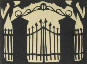
Papercutting is an art form that has been practiced for centuries in many different cultures throughout the world. Being a bit biased, I am particularly drawn to the Southern American heritage of artform of silhouette. A few months ago we discovered this Carew Rice paper cut:
Charleston Gate • Carew Rice • 1933
Rice, a South Carolina native who has been hailed as “America’s Greatest Silhouettist” by the poet Carl Sandberg, was extremely prolific with the medium and brought sophistication and prominence to the technique. The practice derived its name from Eteinne de Silhouette, the French finance minister under Louis XV who imposed high taxes. Since paper-cuts were a more economical way of obtaining a portrait at the time, the business thrived and became a symbol of the economic times, thus forever linking the same “silhouette” with the practice. Silhouettes arrived in America and quickly became the rage in the 18th and 19th century until photography took the forefront. It is now revered for its aesthetic charm and elegant simplicity.
SCBWI‘s annual Tomie dePaola Award is given annually to an SCBWI member illustrator that demonstrates potential and is chosen by Tomie dePaola. The award grants tuition, transportation and accommodations to the New York Winter Conference held in Manhattan, and the winning piece is featured at the annual winter conference in New York.
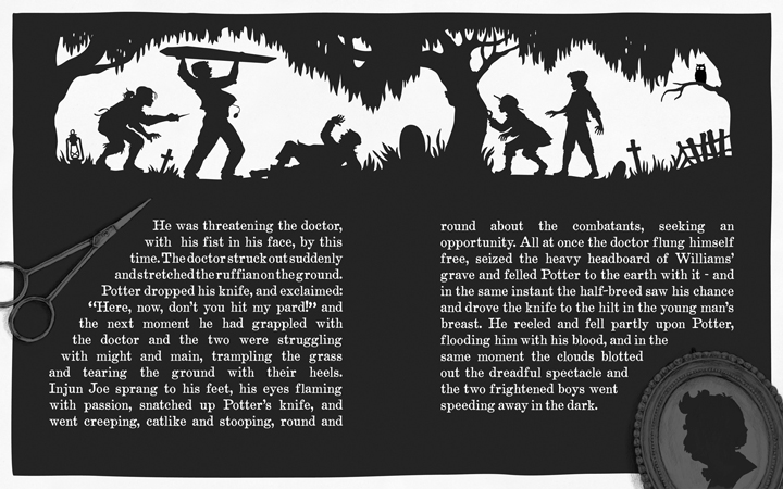
The guidelines for this year’s award were to pick any passage from any one of the following novels: The Adventures of Tom Sawyer (Twain), Little Women (Alcott), The Yearling (Rawlings) The artwork must be in black and white, including half-tones.
This inspired me to pay homage to the southern heritage of paper cutting and the silhouette artform with Mark Twain‘s classic, The Adventures of Tom Sawyer. My intention was to create two narratives. One being a silhouette depiction of the scene, which takes place in chapter 9, and then another on top of that, which is a commentary on the practice of paper cutting depicted by the rendering of the scissors and the framed silhouette portrait of the author. I chose to lay the text in white on top of the black to further intensify the horrific action the boys are witnessing in the graveyard.
Tomie dePaola, reknowned for his books for children, is an illustrator who has been published for over 40 years and has written and/or illustrated nearly 250 books with over 15 million copies of his books sold worldwide. His work and achievements have been recognized with the Smithson Medal from the Smithsonian Institution, the Kerlan Award from the University of Minnesota for his “singular attainment in children’s literature,” and the Regina Medal from the Catholic Library Association. He was also the United States nominee in 1990 for the Hans Christian Andersen Award in illustration. The American Library Association has honored him with a Caldecott Honor Book, a Newbery Honor Book, and the 2011 Laura Ingalls Wilder Award for his “substantial and lasting contribution to literature for children.”
Tomie financially provided the award until 2011 when SCBWI assumed it in recognition of Tomie’s outstanding contribution to SCBWI and to the member illustrators in particular. He has been a member of the Board of Advisors, aided in changing the name of the original organization to include illustrators, founded the Illustrator’s Committee of the SCBWI board, and taught the first master class at an SCBWI conference.
This past weekend, SCBWI Carolinas celebrated their 20th annual conference in Charlotte, NC. I love returning to the well. Inspiring keynotes and energizing breakouts filled our time for three whole days! Illustrators arrived early on Friday for an intensive session with the charming illustrator Priscilla Burris. We were given an assignment ahead of time which was:
Characters Page: Create and develop two characters. Name them.
Main Image: Create and Color Finish an image involving both characters, interacting. (Either one page or 2-pg spread)
Before Image: Create and Sketch an image that shows what happened before the Main Image part of the story.
After Image: Create and Sketch an image that shows what happens after the Main Image part of the story.
Daunting to say the least. No restrictions, not even dimensions. Wide open. I have to admit, when I received this challenge, I was rather disappointed, and frankly had a bad attitude. I wanted something to work with. Please oh please don’t leave me alone in the dark recesses of my shallow creativity to make something completely original! I felt like I was suddenly being asked to write, and I wanted to illustrate! Sadly, I realized that I’ve been relying on someone else’s work to propel me into my work. How was I going to start with a completely blank canvas?
The answer was in creating boundaries. I’ve heard it said that if children are playing in a large field with no fence, they will gather together in a tight radius near the middle and not venture out very far from each other, playing within a very limited space. If, however they are provided a fenced in perimeter, they will utilize all the space for play. I read that Dr. Seuss had only a 225 word list with which to work from in writing Cat in the Hat. Boundaries propel us into creative thinking by forcing us to solve problems. Last year at the convention, writer John Bemis left us with a most inspiring keynote that provided some tools to work with when we are faced with creative blocks. We were all asked to write 20 words, then step back and look at them. What did they say? Where was the common thread? Is there any imagery that comes to mind? Next he shared with us a game that included asking a question, then find a picture (from a magazine or a book). The last step is to connect your question with the image you found. How does the image you found answer your question?
So I decided to play this type of game with my lucid characters I had floating around in my head. I knew I wanted a doll and an owl, but that was where my big idea ended. So I played what I call the “Blind Dictionary” game. This is where you close your eyes and open the dictionary and point. My goal was to find 10 nouns and 10 verbs. Of course I came upon some adjectives and adverbs, but I moved on and didn’t use those. Here were the 10 nouns: (doll and owl I already had), harlequin, thread, hame, factory, kimono, shilling, wheelie, lichen. The 10 verbs were: conspire, spy, twitch, liberate, lick, burn, blow, scoop, retain.Well, I guess that turned out to be only 9, but what resulted was this lush visual material I had now to work with!
So without further ado, meet Commelina:
and her various transformations:
and the clockwork owl, Li:
The illustrated plot sequence:
In the end, I realized I may have some stories to tell after all. If the material is not provided for me, there is material out there if I cut and paste it together and make boundaries. Thank you, Priscilla Burris, and once again, thank you SCBWI!
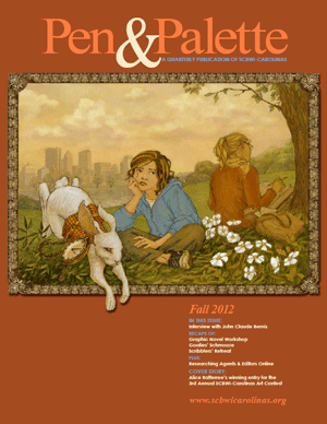
Here are some excepts from my interview in Pen & Palette as SCBWI Carolinas First Place winner for the 2012 Art Contest. Congratulations to Brenda Gilliam and Jennifer Noel Bower who were also recognized for their work.
Rather than focus on a single illustrator, this issue showcases the top three winners of the 3rdAnnual SCBWI Carolinas Art Contest. Alice Ratterree’s first-place entry is featured as this issue’s cover image. Illustrators participating in the contest were asked to render their interpretations of the opening lines of Lewis Carroll’s classic, Alice ’s Adventures in Wonderland :
Alice was beginning to get very tired of sitting by her sister on the bank, and of having nothing to do. Once or twice she peeped into the book her sister was reading, but it had no pictures or conversations in it, “and what is the use of a book,” thought Alice, “without pictures or conversations?” So she was considering in her own mind (as well as she could, for the day made her feel very sleepy and stupid), whether the pleasure of making a daisy-chain would be worth the trouble of getting up and picking daisies, when suddenly a White Rabbit with pink eyes ran close by her.
What about this year’s prompt spoke to you? What aspect of the story drew you in?
ALICE RATTERREE: I am always inspired by the classics, and particularly have identified with Alice. Maybe it’s the name thing—as silly as it sounds—but as a child I really did believe this was a story written just for (and about) me! I had a healthy dose of Lewis Carroll growing up (being the child of a schoolteacher who devoted an entire unit to the Alice books and Carroll’s use of political satire and mathematics), so naturally, when faced with the prompt, I already felt at home with the text.
What drew me into this challenge was the lushness of the introduction. In only a few sentences, we are given a vast amount of information on the lazy setting of the afternoon and Alice’s attitude about it, then immediately propelled into the story. The task of portraying Alice’s restlessness and boredom juxtaposed with the action of the rabbit was, in my mind, the foundation for the composition.
How did you decide what your approach would be (style, composition, medium)?
ALICE RATTERREE: So many artists have tackled this work, and we’re all standing in the shadow of the giant, John Tenniel. I wanted to offer something fresh and surprising, but honor the timelessness of the story. My goal was to utilize a classic illustration drafting technique inside a modern era setting, costuming Alice in hoodie and jeans (complete with the pre-adolescent pout) and portraying her sister as the consummate graduate student (perhaps herself not entirely thrilled with having her sister tag along due to whatever multitude of reasons this circumstance could be translated to today) and involved in her many textbooks “without pictures.”
The process and composition sort of evolved, as opposed to being a conscious decision. The most challenging aspect of the prompt was that each character is seemingly independent and unconnected with each other, involved in their own spheres of activity (or inactivity), and while we know that Alice eventually sees the rabbit and reacts by following him down the hole out of curiosity, we, the readers, are introduced to him (I believe) the moment right before she actually sees him…or at least that split second between a double take.
It is this rabbit figure that grabbed me most because Carroll elevates him by capitalizing the “W” and the “R” and I couldn’t shake the feeling that this character carried an omnipotent quality. He’s the one who takes us by surprise out of that lazy afternoon by the riverbank, and as a reader, I am as much surprised by the appearance of him as Alice. Therefore I wanted to make him not only the one active figure in the composition, but to also be the connection between the viewer and the illustration, looking straight at us (inspired by Lewis’ poignant mention of the pink eyes), and literally emerging from that still place.
With all of that floating around in my head, and without structure, I started drafting each figure independently, and the whole process started to work like a pop-up book. Using Photoshop, I manipulated each figure like paper dolls in three spatial planes of existence – first the rabbit, then Alice, and then her sister and landscape. So once the final composition came together, I completed the piece by painting in Photoshop.
How did the exercise of completing the contest entry, and the feedback from the contest judge, benefit your work?
ALICE RATTERREE: The main lesson I learned through the exercise was commitment and conviction. Somewhere in the process of trying to connect these three independent characters, I started traveling down the road of self-doubt and started over completely with a few new drafts. In the end, I came back to my original concept, determined to commit to it and attempt to make it work.
The feedback was very helpful because the viewer addressed this accountability for the two choices I had made that deviated somewhat from traditional expectation: 1) Alice in somewhat of a visually secondary role to the rabbit, and 2) the lack of connection between the rabbit and Alice. This observation has helped me realize that when making choices, particularly those that may be unconventional and unexpected, I need to work on making them clear and intentional. Commitment and conviction.
There are plenty of resources out there about how to put a price tag on our work. Some metric is lying around out there that perfectly calculates time spent on a project, education and training, taxes (eek!), and just good old fashioned supply and demand (although the truth is, as illustrators, we all offer something completely unique that cannot be imitated, right? Well, at least that’s the life-long goal)
But that’s not the question I’m asking.
I want something a little more intangible, but a lot more valuable. I want something that I will live off of the rest of my life (that’s not imprinted with past presidents) I want learn something about myself and about my craft. I want to be charged creatively, and desire to go to work each day. I want to WANT to wake up early and stay up late getting it right. I want inspiration and challenge. I want to dive into the deeper recesses of myself and find a way to put a little part of my heart on to that paper that will be here (hopefully) long after I’m gone.
Is that too much to ask of a client? Of course. But it is not too much to ask of myself.
Whatever the task, it is up to us as illustrators to discover something new about ourselves and our work, our process, our creative energy. It is up to us to generate or seek out the source of inspiration for our projects.What can I learn from this experience? How can I grow as an artist? What would make this project creatively challenging for me? How can I learn to increase quality and decrease time spent, therefore being more EFFICIENT? When do I work best? When should I stop and rest? The path to this creative balance or nirvana, is loaded with questions. Questions that need to be explored, not necessarily answered once- but over and over again.
Promo note: visit Diandra Mae fellow SCBWI member and illustrator. Her blog hosts “Sweet Squares”, a daily practice activity challenge similar to P3. I love it!
Materials, from Art and Fear by David Bayles and Ted Orland
“The materials of art, like the thumbnail sketch, seduce us with their potential. The texture of the paper, the smell of the paint, the weight of the stone – all cast hints and innuendoes, beckoning our fantasies…But where materials have potential, they also have limits. Ink wants to flow, but not across just any surface; clay wants to hold shape, but not just any shape. And in any case, without your active participation their potential remains just that – potential…What counts, in making art, is the actual fit between the contents of your head and the qualities of your materials.”
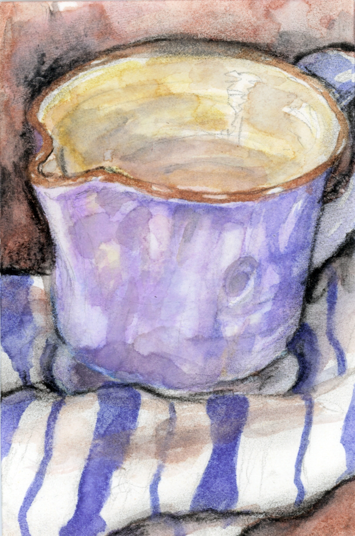
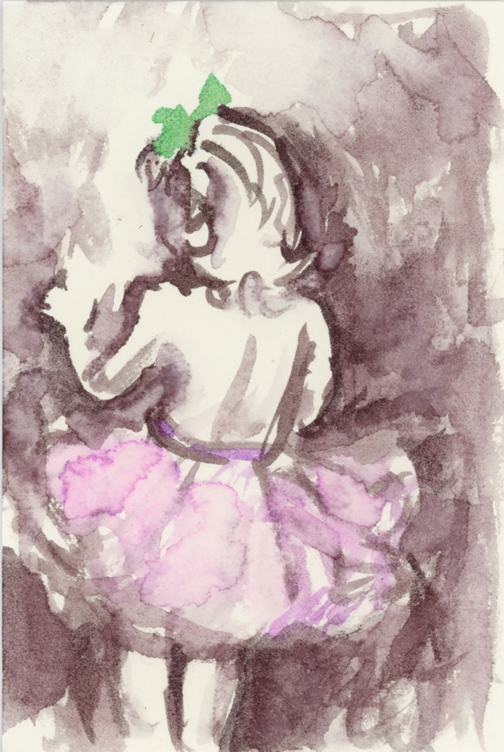
The Petite Painting Project travelled last week. For seven days I was out of my usual creative space with two small children in tow. It was almost next to impossible, but I did it. The posting slowed, but I kept coming back to the paper each day and here’s what I learned. If I don’t do this in the morning hours, the work suffers. I loose my enthusiasm, energy and desire to be creative as the day wears on. Morning has always been a time of inspiration for me. I remember waking up as a child giddy with excitement about the acres of time that lay before me with endless possibilities of how to spend it.
At the SCBWI conference this summer, Tony DiTerlizzi spoke about reaching back into our past to unearth what inspired us when we were children. What made 10 year old Alice get up early to play? What charged child Alice into creative action? In order to go forward, I have to go backward – back to the child self and rediscover that which makes me truly uniquely me. As my skills develop and my ability allows me to achieve success, I also become detached from that child who is the key to making it all work in the first place. Skill can be developed to near perfection, but if the youthful magic is lost, then what good is all the training?
So for me, P3 must happen in the morning, when I am excited about the possibilities. One of my favorite books is Art & Fear by David Bayles and Ted Orland. It’s a tiny thin book packed with lessons and observations about how art gets made. In one passage, the authors discuss how painting a picture is an act of diminishing possibilities. A blank canvas holds the most opportunity. Anything can happen, and the moment that the first stroke is made, then thousands of options immediately are wiped out. Each successive stroke therefore eliminates possibility until the end, where the final stroke can exist in no other realm except within that painting. I suppose that is why joy cometh in the morning, why babies hold our dreams, and why wonder lies at the beginning of an uncertain journey.
Last weekend, my grandmother was finally put to rest. The curtain was closed on her life and we all gathered and dwelled for a few days in the twilight of living things. Her home still holds picture frames and ticking clocks, china plates carefully selected, toys for grandchildren and great-grandchildren, her perfume, her pillow. I dream she is at the beginning of a new an uncertain journey where possibilities are endless.
I have a new favorite book: Still Life with Oysters and Lemonby Mark Doty. Saying that this is my favorite book right now does not do justice to the experience I’ve had with this book, particularly at the timing of when I read it, which happened to be last weekend. Isn’t that a large part of what makes a book so meaningful to us – the timing they enter our lives? Although I just recently read this book, it actually came to me almost a year earlier. In the fall of 2011, I attended the SCBWI Carolinas conference and met illustrator David Diaz, who was guest faculty providing intensives and portfolio reviews. In the midst of discussing my portfolio, he told me about a mentorship program that had recently been established at the SCBWI national conferences, and graciously invited me and fellow SCBWI Carolinas member and ARA, Bonnie Adamson, to join them for a weekend intensive the following month in his hometown of Carlsbad, California (which I might add -like most places in California- is full of beauty, to this east coast native) My favorite question is “What was the last book you read?” So I asked this of David, and he handed me Still Life with Oysters and Lemon. On the plane trip home I started the first few pages and quickly realized that this little book’s size was deceiving. It was intense and required more from me than I had after a weekend of non-stop discussion on the illustration and art-making process. So when I returned home, I placed it on the bedside dresser drawer with the mental “to read next” note. There it remained for two and a half seasons.
Fast forward to this summer: While packing to attend the SCBWI National Conference in LA, and it occurred to me that this book still sat in the drawer. It of course should rightfully be returned it to its owner, whom I would be seeing at the event. Ashamed about neglecting my homework, I gave myself one last task: READ THIS ON THE PLANE. So while I began this little book out of a mixture of obligation, guilt, but also the genuine desire to get my head into a place of reflective preparedness for the weekend, Doty’s prose wrapped itself around me I received every drop like a warm sponge. What begins as a moment in a museum, where the author is captivated by a particular painting by Jan Davidsz de Heem (Still Life with Oysters and Lemon) becomes a philosophical journey into the intimacy we share with objects, the permanence and impermanence of earthly pleasures. By exploring the dutch masters of still life painting, Doty captures the essence of why we are drawn to still life. At one point he refers on the painters love affair with light – and ultimately, that all painting starts with love. That stuck with me, particularly in light of the many notes I heard at the conference that weekend.
There was much talk of love inside of our work, whether that be as a writer or an illustrator. EB Lewis told us to bring to the table ourselves – our own souls and experiences, what we LOVE. Draw what you love and what you know. During his breakout session, he offered a short documentary by National Geographic photographer Dewitt Jones, in which the prevailing mesaage was about how to recognize the beauty around us. The extraordinary lives in the ordinary. “By celebrating what is right with the world, we are given the energy to fix what is wrong.” Author Ruta Sepetys asked us, “What are you willing to give in order to create? What are you longing for? What do you hide?” If we are bold enough to lay bare our broken selves, then “the wind will blow through our hollow places, and someday may cool and heal a reader.” So much courage is needed to expose love and fear in order to create, but without, I’m not sure we can be successful in connecting with our listeners, our viewers. As the final keynote speaker, Gary Schmidt instilled in us this most important lesson: You will never learn to love art well until you learn to love what art mirrors better….the world. Love the world.
While travelling last weekend, I received the call that my grandmother had died. What remains?
Permanence. Impermanence. Love and objects.


 Rather than focus on a single illustrator,