[vc_row content_text_aligment=”” use_row_as_full_screen_section=”no”][vc_column][vc_column_text]Vivamus elementum semper nisi. Aenean vulputate eleifend tellus. Aenean leo ligula, porttitor eu, consequat vitae, eleifend ac, enim. Aliquam lorem ante, dapibus in, viverra quis, feugiat a, tellus. Phasellus viverra nulla ut metus varius laoreet. Quisque rutrum. Aenean imperdiet. Etiam ultricies nisi vel augue. Curabitur ullamcorper ultricies nisi. Nam eget dui. Etiam rhoncus. Maecenas tempus, tellus eget condimentum rhoncus, sem quam semper libero, sit amet adipiscing sem neque sed ipsum. Nam quam nunc, blandit vel, luctus pulvinar, hendrerit id, lorem. Maecenas nec odio et ante tincidunt tempus. Donec vitae sapien ut libero venenatis faucibus. Nullam quis ante. Etiam sit amet orci eget eros faucibus tincidunt. Duis leo. Sed fringilla mauris sit amet nibh. Donec sodales sagittis magna. Sed consequat, leo eget bibendum sodales.[/vc_column_text][vc_empty_space height=”12″][vc_column_text]
Vivamus elementum semper nisi. Aenean vulputate eleifend tellus. Aenean leo ligula, porttitor eu, consequat vitae, eleifend ac, enim. Aliquam lorem ante, dapibus in, viverra quis, feugiat a, tellus.
[/vc_column_text][vc_empty_space height=”18″][vc_column_text]Vivamus elementum semper nisi. Aenean vulputate eleifend tellus. Aenean leo ligula, porttitor eu, consequat vitae, eleifend ac, enim. Aliquam lorem ante, dapibus in, viverra quis, feugiat a, tellus. Phasellus viverra nulla ut metus varius laoreet. Quisque rutrum. Aenean imperdiet. Etiam ultricies nisi vel augue. Curabitur ullamcorper ultricies nisi. Nam eget dui. Etiam rhoncus. Maecenas tempus, tellus eget condimentum rhoncus, sem quam semper libero, sit amet adipiscing sem neque sed ipsum. Etiam ultricies nisi vel augue.[/vc_column_text][/vc_column][/vc_row]
It’s wonderful to be a part the picnic blog series by Peachtree Publishers. Since Atlanta is close to my home in Greenville, I can take a break from my studio and drop by and visit. Every time I have been greeted with warm smiles. Usually we gather around a large table framed by a wall of windows that let in that famous Georgia sun. In addition to talking about the manuscript, it has been wonderful to hear all their amazing stories and easy laughter that is shared in our circle. In the afternoon when I depart, I drive home with the feeling my day was spent in the company of a family of friends.
When I think back about picnics, my grandfather’s farm is the first thing that I remember. Each summer on the Fourth of July, our family and friends would gather at the top of his hill underneath a large tree. Stretching out before me was only the sloping landscape, with a rocky path that led into a small patch of woods. He had a secret pond that I believed to be a magical door to another world. Standing on that hill looking out at the glorious horizon, I felt small and brave at the same time. I believed in a bigger world out there, and felt compelled to unearth its surprises.
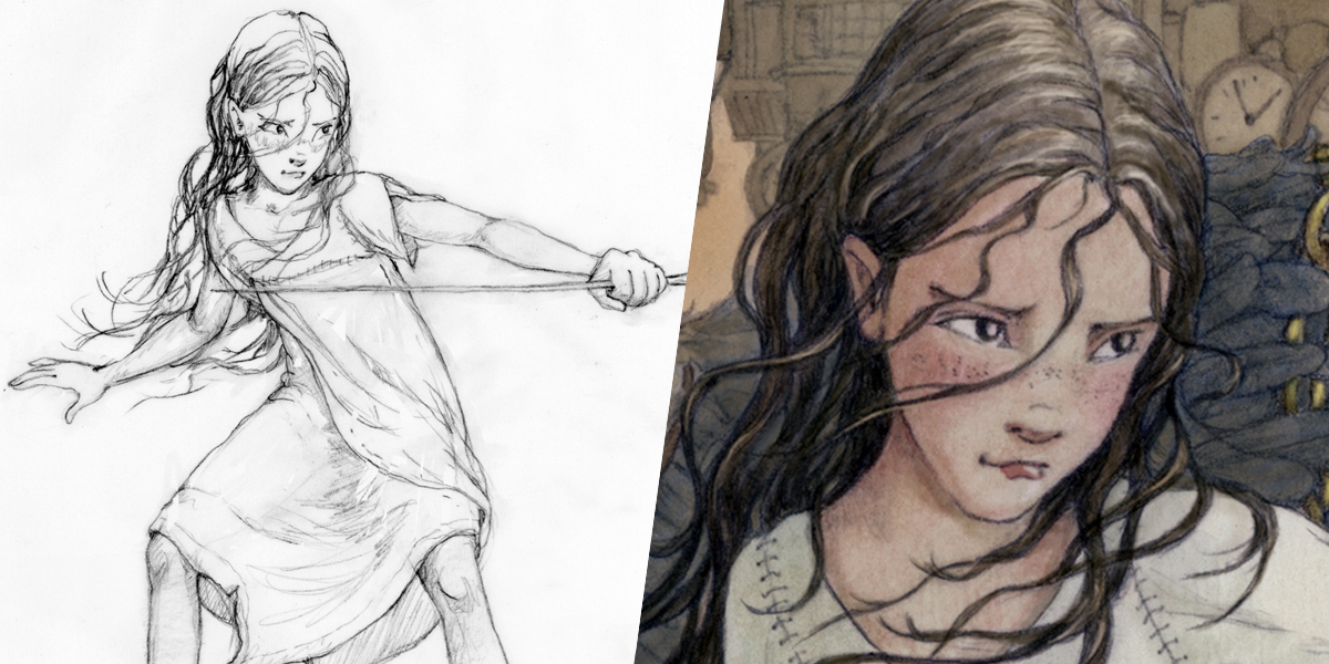
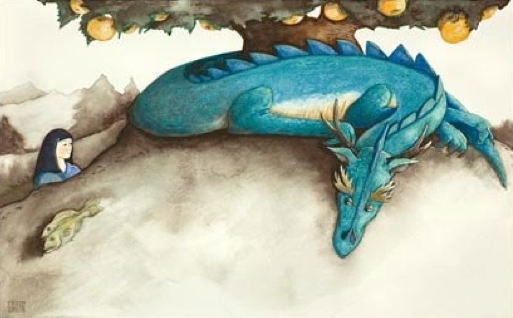
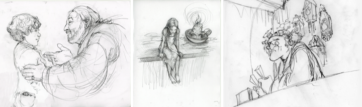
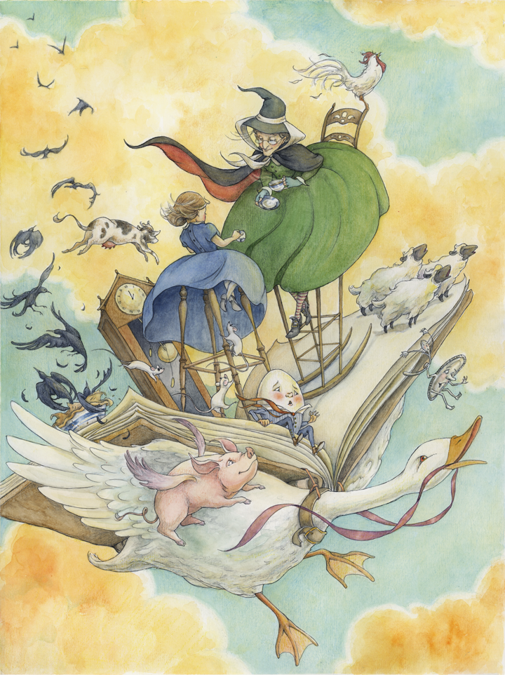
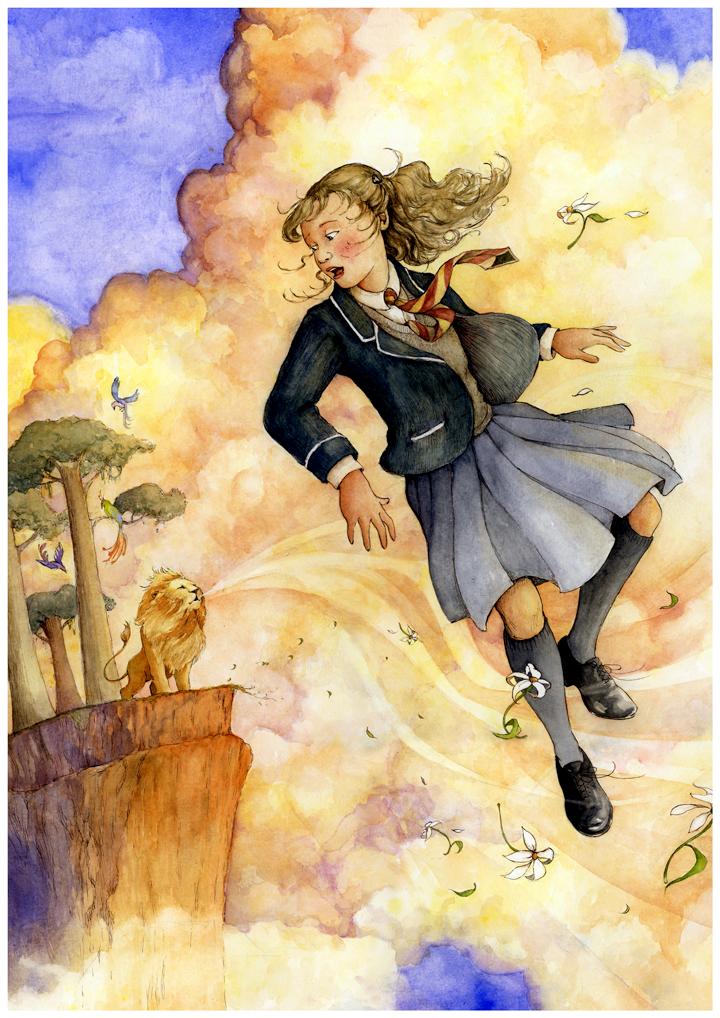
Lilliput inspired me because it is a story about those kinds of horizons, and the transformation that happens within us when we are taken outside of what we know. Author Sam Gayton captivated me right away by harnessing that sense of wonder in Lily’s discovery of a larger world. As an illustrator, it was fun to play with physical scale and action for an adventure story about a small person in a big world. I admire Lily’s bravery and how she harnesses the courage to face her enemies, trust a friend and ultimately forgive her captor. Sam created such fantastically distinct characters throughout his book that I think my favorite part of the process was coming up with the appearance for each of them and “casting” the story with my first character sketches.
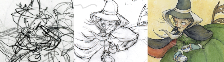
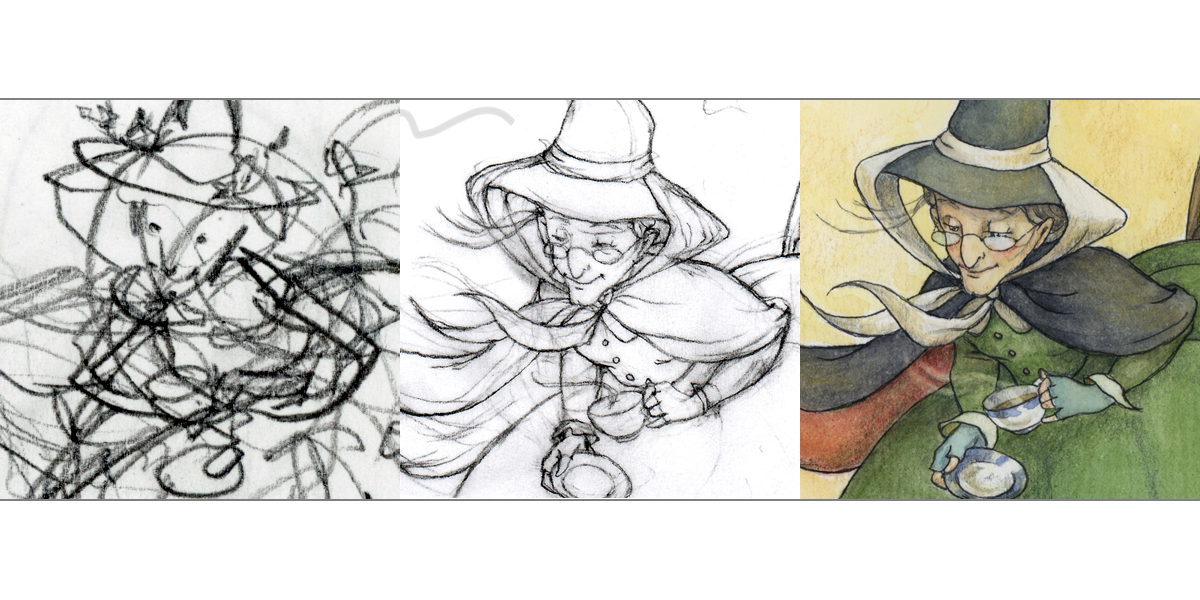
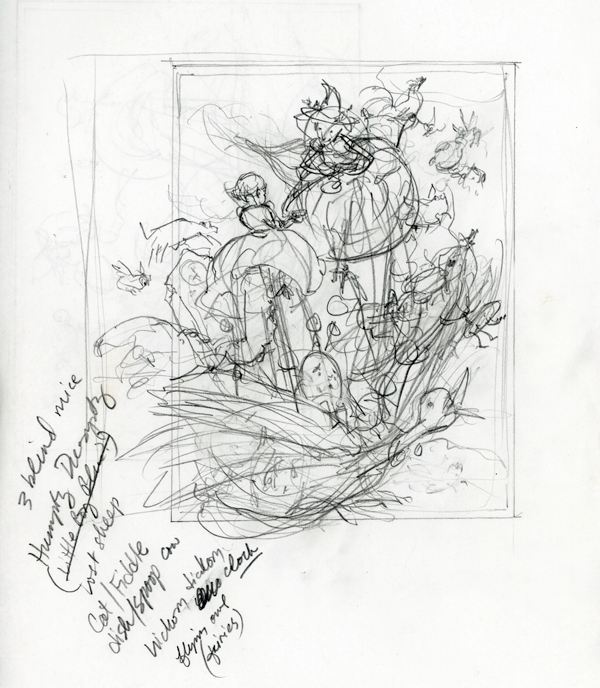
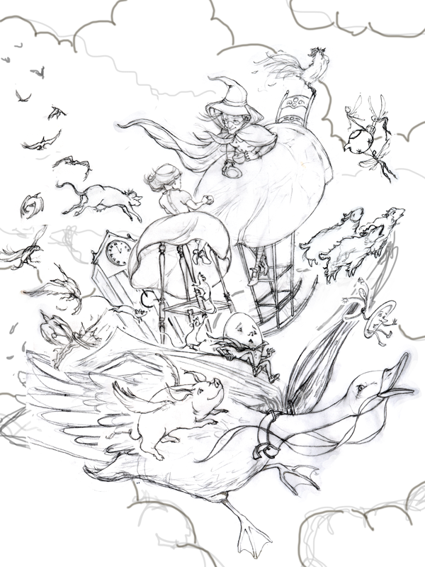
After creating the characters, I moved onto a series of thumbnails for various scenes in the story. This involved branching out to visualize the environment, which was inspired again by the author’s ability to create a particular mood and setting. From these thumbnail images, I made some further edits and drew more detailed drawings. At times, it was helpful to think about envisioning an image from different perspectives.
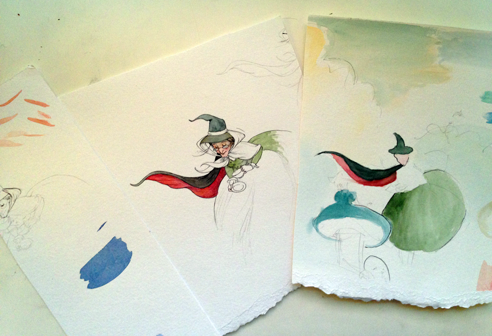
Once my final drawings were complete, I added a watercolor wash. With a middle-grade novel, the interiors are often printed in black and white. Since my color palette was limited, my main focus was on the values ranges between light and dark. This was a challenge because a lot of the story happens in the shadows. Lily spends most of her time in a setting where it is either at night or she is confined to an enclosed interior space. Throughout this story, Lily clings fiercely to hope and I tried to associate that emotion visually with elements of light. Many times that moment of light appears as something just out of reach…a distant star, a candle burning from across the room or indirect light cast from a window. I approached all of this if I was in a dark theatre and was being asked to bring up the lights one by one, then making a decision when it was time to stop.
Many of you might be interested to know that I started my career as a classical singer. I received my MM in Voice Performance from Boston University and was very fortunate to have some success performing in opera, musical theatre and oratorio. As an illustrator, my visual influences come from my experiences on the stage. There is a familiar process in the decisions that happen in casting roles, designing costumes, creating sets, establishing the correct lighting and directing the action. It has been an adventure to embrace the life of an illustrator after spending so much time in another world. In both of these endeavors my goal has always been to create a sense of wonder and magic. I have been so lucky to have great mentors and heroines that I’ve found through the Society of Children’s Book Writers and Illustrators (SCBWI) – none bigger than my agent Marietta Zacker of the Galt & Zacker Literary Agency. She has inspired a sense of discovery of the untapped potential in me, and the hope of new possibilities that lie ahead.
Do you have heroes and heroines? Is it someone close to you, or do you find your inspiration from someone in a book like Lily? Feel free to post below, or visit me at www.aliceink.com. I look forward to hearing from you!
Guest Interview and Blog for Peachtree Publishers Picnic Series in 6/2015.
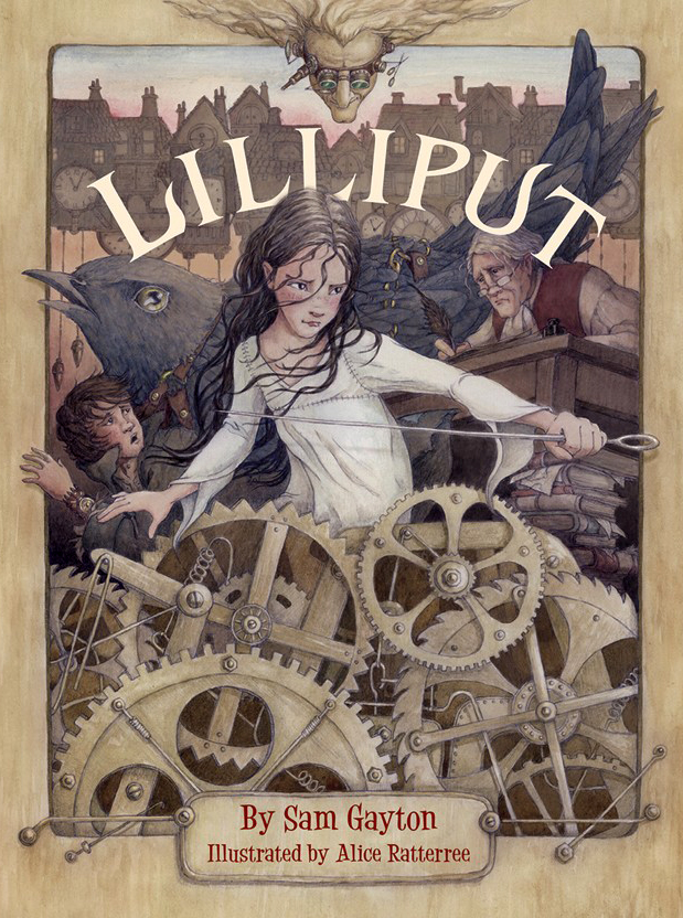
This weekend marks the birthday of LILLIPUT written by Sam Gayton, published by Peachtree Publishers!
A thrilling sequel to Swift’s Gulliver’s Travels, this mid-grade novel is certain to capture young readers, introducing them to the fantasy genre while paying homage to a beloved classic. It was so much fun creating the cover and interior illustrations. I immediately fell in love with main character Lily’s brave spirit, and was swept away by the 18th-century London setting, from the buckled shoes to haunting rooftops. My gratitude goes out to Sam for his inspiring words, and to Stephanie Fretwell-Hill and Nicola Simmonds Carmack for their support with art direction and design.
For those of you in the NYC area, Sam will be at the Bank Street Library (5th floor, Salon #2) on Friday August 7 from 5:00-6:30 PM to discuss Lilliput! For more details, visit: http://www.bankstreet.edu/events/details/460/
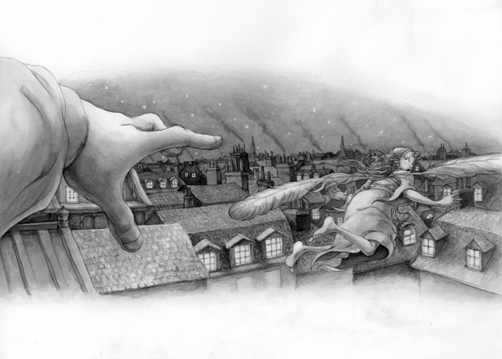
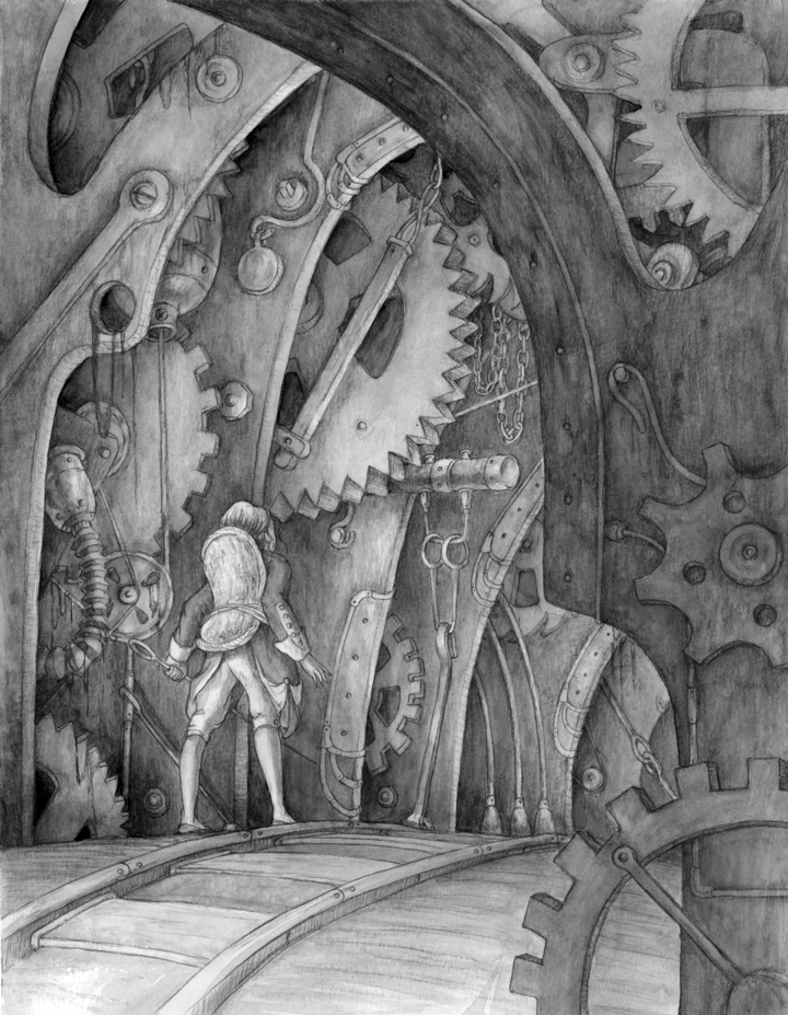
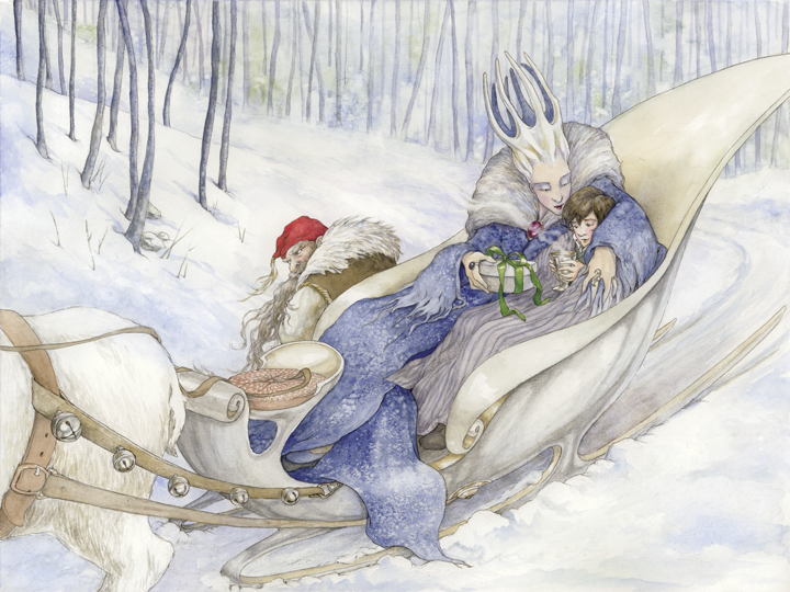
Here is a sneak peek of a few of the many exciting scenes in LILLIPUT. (For an inside look into the process of creating the illustrations, check out my recent post for Peachtree’s Publishers.)
This week, I am joining an international blog hop. So what ever is a blog hop anyway? you might ask….It’s is a way of blogging in which one blogger introduces a topic of conversation and then invites another to continue the conversation the following week on their own blog, who then in turn invites someone to post the next week after that (and so on and so on). In addition to allowing readers and participants to engage in an ongoing conversation centered on a common theme, it also connects people together who may not have otherwise known each other.
For this particular hop, we’ve all been asked the following questions: 1) What are you working on? 2) How does your work differ from others in it’s genre? 3) Why do you write/create what you do? 4) How does your process work?
So hop on board and let me escort you along this week!
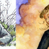
First, I must start by introducing the artist who invited me to join, Susan Sorrell Hill. Susan’s work immediately stole my heart. A kindred spirit in the realm of the faerie tale, she easily embraces other worlds – delivering them with majestic understated grace – and makes them believable. I can’t wait to see her story “The Emperor’s Pear Tree” (isn’t that a magical title) in print someday. Here’s a sneak peek image from it:
Last week, Susan answered these questions in her “Around the World” blog post. And if you have the chance, follow the trail back – you’ll find some tasty creative treats to nibble on! (I must be getting my appetite ready for the holidays)
What are you working on?
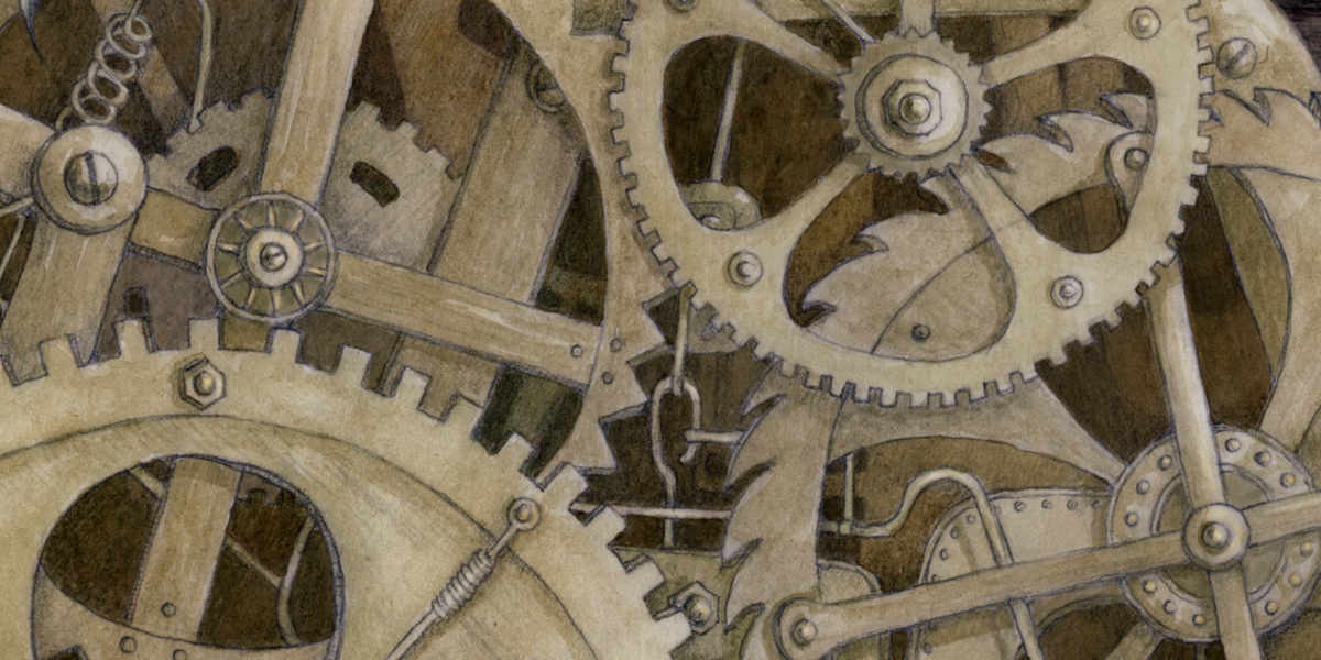
My primary job these days is illustrating a middle grade novel entitled “Lilliput” (by Sam Gayton) which will be published here in the US by Peachtree Publishers (due to be on the shelves in the fall of next year) The moment I read the manuscript, I knew it was for me – it’s rich with London rooftops, buckled shoes, thimbles, maps, and even a mad clockmaker! Here are some of my early character sketches….
If I can carve out extra time, it’s nice to balance the work at hand with personal exploration. One of my favorite series is the Narnia Chronicles and so recently I tackled a scene from it using a set of Copic pens I wanted to test out.
Along the topic, I recently signed with agent Marietta B. Zacker of the Nancy Gallt Literary Agency. Since the partnership will allow me to shift more of my focus to working in the studio, I’m anticipating a very fun and productive year ahead!
How does your work differ from others in it’s genre?
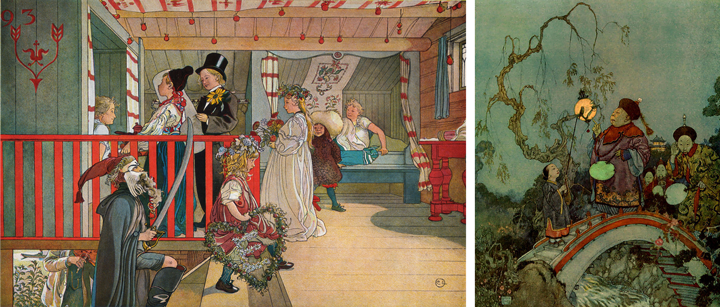
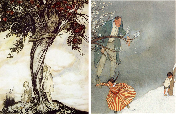
A big question, and one that I wish I could answer easily. What I can talk about, though, is how I fit into a history of artists. All artists align themselves with a certain lineage of other artists who have influenced them. Recognizing which family of artists you belong to is an important part of understanding art making and finding your own process. I’ve always felt a strong kinship with the “Golden Age” of children’s book illustration, a movement that began with George Cruikshank in the early part of the 19th century. It flourished into the recognition of artists such as John Tenniel (famous for his Alice in Wonderland illustrations), Randolph Caldecott (after whom the prestigious award is named) and Kate Greenaway (undoubtedly a master of nursery rhyme books). I’ve also been a big fan of the poster art and line work of Alphonse Mucha. Other favorites of mine: Carl Larsson (such perfectly balanced composition), Edmund Dulac (color, color, color), Arthur Rackham (ah, what glorious trees), and the more contemporary Lisbeth Zwerger (check out how she masterfully utilizes empty space).
L: Carl Larsson, R: Edmund DulacL: Arthur Rackham, R: Lisbeth Zwerger
Why do you write/create what you do?
WHY aligns with a set of values. It is personal and will be different for everyone. I wrote a blog post (The most important question illustrators need to answer) that passes along a concept created by Simon Sinek called the Golden Circle. I strongly recommend visiting his site where you can learn more about how to find your “WHY.” Tony DiTerlizzi, in one of his SCBWI keynote speeches, “Never Abandon Imagination” (a phrase that sums up his own “why” and also serves as the masthead for his site) discussed the importance of finding what used to make you excited as a child – what motivated you to start creating. This part of us has nothing to do with the desire to generate income or be recognized.
Everyone must take time every day to leave reality behind and entertain the possibility of the extraordinary. Faeries do exist. Narnia is just a walk through a wardrobe, or perhaps just around the corner. You can fall through a rabbit hole and end up in a world where the illogical reigns over logic. Magic can be harnessed. The grotesque can be beautiful. Stories provide a playground where we can ponder truth and discover our own values, while also discovering what we share in common with one another. Where no one is alone.
How does your process work?
My process is straightforward: Thumbnail to finished drawing, transfer to watercolor paper, paint. The detailed blog post about it is recorded in my journals here (Illustrating Mother Goose)
@Alice Ratterree on process
If I want a more glossy look, sometimes I import a finished painting into Photoshop and add more paint digitally – it just depends on the piece and what its final use will be. I would not call myself a painter. Rather, it seems better to say that I create painted drawings. First and foremost to me is the integrity of the drawing itself. This makes the issue of transferring a bit terrifying because no matter how well you trace an image with a light box, you will always end up with an entirely different drawing. Sometimes it benefits to have the spontaneity that comes from a traced transfer, but most of the time I like to prepare a drawing that can be output to watercolor paper. I work with a local printer, George Lee, who produces prints for me onto my own paper. In addition to having a state-of-the-art printing system that houses waterproof inks, George is extremely attentive to detail and is always willing to go the extra mile to make sure the product he delivers is flawless. He also makes beautiful fine art prints of finished pieces!
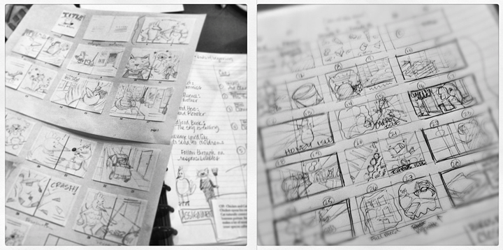
So without further ado, I pass the torch over to Kelli Thrasher-Books, whom I had the privilege of meeting at last year’s Highlights Advanced Illustrator Workshop(an event I recommend to all aspiring illustrators) In addition to being an illustrator, Kelli has also spent many years working as a graphic designer and I’m really looking forward to hearing what she adds to the conversation about her process! I particularly love these images she has documented of her storyboarding work.
One of my favorite annual events is Metropolitan Arts Council‘s “Flat Out Under Pressure” (FOUP) contest. In its fifth year, this program intertwines visual arts and sound environmental practices in downtown Greenville. FOUP provides eight recycling bins for paper, plastic and glass in various locations along Main Street, encouraging recycling among pedestrians while creating a different exhibiting opportunity for visual artists.
The event, which took place this year at the end of June, begins with a 24-hour art-making juried competition. Each participant comes to the MAC office to have their surfaces officially stamped.
my stamped blank surface ready to go! 9:00 am, June 27, 2014
Artists may stamp as many surfaces as they like, but only one can return within 24 hours as an official submitted work of art. Once returned, the pieces are then juried that afternoon with an awards reception held in the evening. In addition to receiving cash prizes, selected winners have the opportunity to choose two images of their work for reproduction on the downtown recycling bins. 1st place winner even gets a week-long trip to Italy to stay in the beautiful Villa Sant’ Andrea! (Here’s to hoping for that one someday) The show is displayed in the MAC Gallery throughout the month of July.
So for the process: How to prepare for having only 24 hours to create a finished work of art?
It began with a thumbnail:
mother goose brainstorming
To keep the energy of the thumbnail, I scanned imported to Photoshop and then increased size of the thumbnail which was roughly 6″ by about 7.5″ to fit the paper I would use, 12×16″ – so about a 200% increase.
I then used tracing paper to trace the thumbnail and add detail…
adding detail from thumbnail using tracing paper
Since I didn’t have tracing paper that was 12×16″ each figure or group of figures was worked on separately. I then scanned them into Photoshop and added each image carefully over the original thumbnail file in a separate layer. The result was a “final” sketch compilation:
“final” sketch of compiled scans in Photoshop
This was printed out to scale (took about 4 sheets of ltr paper, which I pasted together) All of this was prepped and ready to go before the event. The evening before the event I had fun transferring a few sections and working with the color palette.
color and line practice before the big event.
So once I had my surface stamped, I was able to promptly bring it home, and have a full 24 hours to transfer the sketch using a light box, ink and paint it. 24 hours goes by pretty fast even when you pull an all-nighter!
I usually like to feature an illustrator for every blog post, but today I have several. The following illustrators were selected for the annual SCBWI mentorship program. Take a moment to check out their amazing work!
So you’re going to illustrate a children’s book. Congratulations!
Before you grab a brush and start on a piece of finished art, a few decisions must be made. To name a handful : how many pages/spreads there are, where the type needs to be placed (this may be flexible), color or black and white, spot illustrations (small drawings that stand alone, with minimal or no background elements) or full bleed illustrations (meaning the entire page is covered to the edge) and most importantly, the dimensions of the book- thus directing the dimensions of the illustrations, which will ultimately help when you create the composition. Luckily you do not have to bear the burden of making all of these decisions alone. The Publisher will (most likely) provide the answers to most these questions for you, and if not, make sure you come to an agreement together so there are no surprises after you have put in the hours.
Size
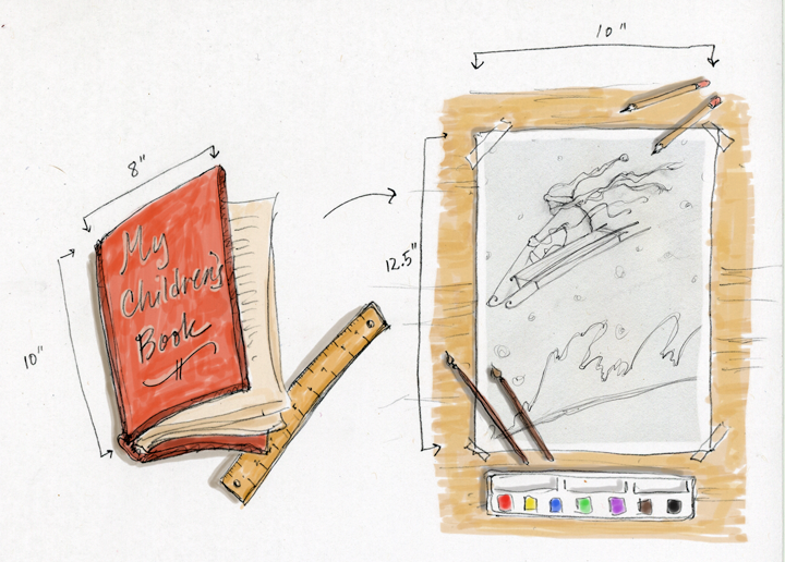
Sizes vary in the industry and thankfully the publisher will inform you of the size of the book or provide a choice of options for you to consider. You don’t have to work at 100% scale, and many times should not. Take a look at any juvenile book cover. Many of those are printed around 6″x8″ or smaller. Who wants to (and can successfully) work at that scale? Picture books have a larger standard (in the ballpark around 8×8, 8×10, 9×11…) but there are still benefits to working larger than the final print size. For one, you enjoy more freedom to experiment with various mediums. Secondly, when a final illustration is scaled down, a certain magic happens in which details become a little more crisp, edges sharpen up a bit, and I’ve even found that color intensifies.
The most important thing to consider is maintaining proportion. For example, an 8″x10″ book proportionally increased by 25% would be 10″x12.5″ Never work smaller than the finished size, or you will loose image quality when you enlarge the image to fit the page. Also, try not to get too large either, or detail becomes lost when grossly scaled down. The trick is finding what percentage increase works with your work medium and style.
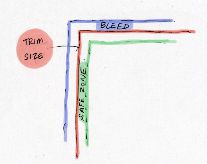
Remember to include a bleed of at least 1/4 inch. (This is the part of the illustration that runs off the edge of the page) So for the example mentioned, the 8″x10″ book illustrated at 10″x12.15″ would have an extra 1/4″ added around for the bleed, making the drawing 10.25″x12.75″ In addition, make sure to leave a safe zone (an area free of your main action) of about 1/4″ inside the trim area.
Medium? Type of Paper? That is up to you. However, the reason to address this decision is because it does have a relationship with the size of your work. For example, if you love cross-hatch work with a crow quill pen, that works great for smaller, more detailed drawings, but if you prefer a large round brush and acrylics, you will need larger surfaces. The key is to find your own “sweet spot” between your preferred media and the size of your work.
Check out Elizabeth Bird’s blog post that provides more nice examples of re-illustrated books. She poses the question: “Do any of these improve on the original? Or is re-illustration never really a case of improvement but rather giving kids a variety of different ways to look at something familiar?”
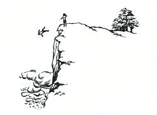
While there are many different views on the subject, the latter is where I choose to stand. I have the highest respect for the magnificent Pauline Baynes, and marvel over her effortless use of lines and loose color washes she added to her original Narnia illustrations. People forever will (and should) honor those drawings as the quintessential benchmark for the world of Narnia. But as an illustrator how can I help myself when I read C.S. Lewis?
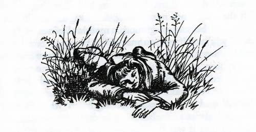
“Stand still. In a moment I will blow. But, first, remember, remember, remember the signs. Say them to yourself when you wake in the morning and when you lie down at night, and when you wake in the middle of the night. And whatever strange things may happen to you, let nothing turn your mind from following the signs. And secondly, I give you a warning. Here on the mountain I have spoken to you clearly: I will not often do so down in Narnia. Here on the mountain, the air is clear and your mind is clear; as you drop down into Narnia, the air will thicken. Take great care that it does not confuse your mind. And the signs which you have learned here will not look at all as you expect them to look, when you meet them there. That is why it is so important to know them by heart and pay no attention to appearances. Remember the signs and believe the signs. Nothing else matters. And now, daughter of Eve, farewell – “ The voice had been growing softer towards the end of this speech and now it faded away altogether. Jill looked behind her. To her astonishment she saw the cliff already more than a hundred yards behind her, and the Lion himself a speck of bright gold on the edge of it. She had been setting her teeth and clenching her fists for a terrible blast of lion’s breath; but the breath had really been so gentle that she had not even noticed the moment at which she left the earth. And now, there was nothing but air for thousands upon thousands of feet below her. – The Silver Chair, chapter 2, The Chronicles of Narnia (C.S. Lewis)
Here are two of Pauline Baynes’ original illustrations surrounding the above scene published in 1953:
Original 1953 illustration by Pauline Baynes The Silver Chair, chapter 1Original 1953 illustration by Pauline Baynes The Silver Chair, chapter 2
In 1998, Ms. Baynes added water-color washes to the original black and white line illustrations for the seven volumes of Narnia:
Baynes’ illustration after her addition of watercolor in 1998 The Silver Chair, chapter 1Baynes’ illustration after her addition of watercolor in 1998 The Silver Chair, chapter 2
And my own interpretation:
Jill is given a Task The Silver Chair, The Chronicles of Narnia (C.S. Lewis) illustration by Alice Ratterree
What are your favorite re-illustrated classics? Are there any classics you would like to see re-imagined?
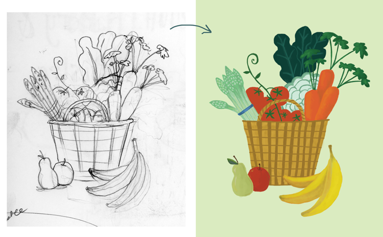
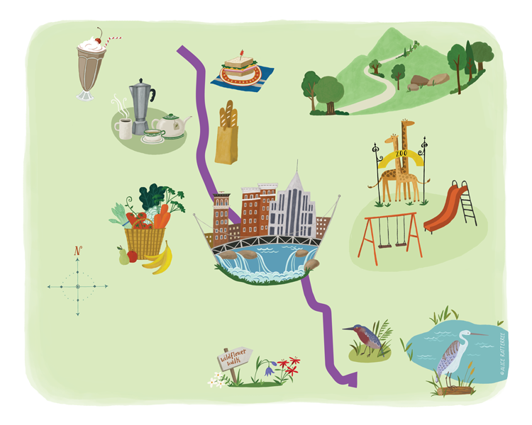
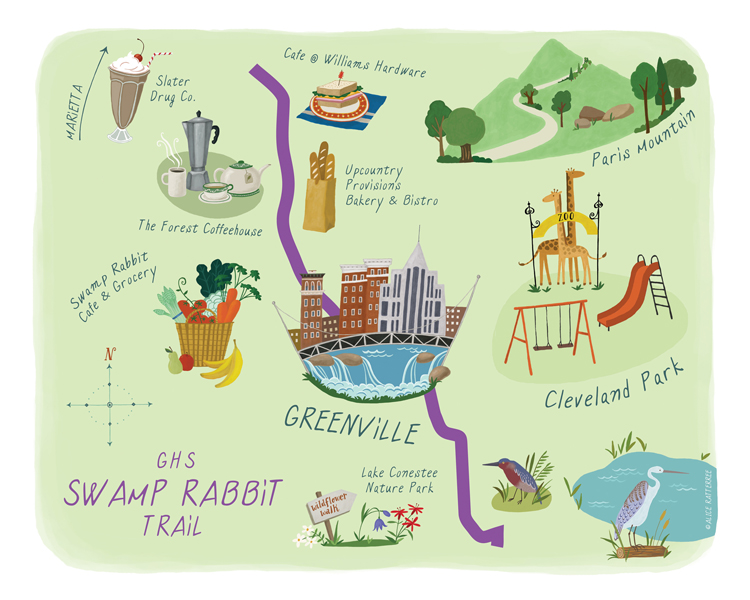
The process, while brand new to me, proved to be very rewarding. It began with a conversation with the editor, in which she provided the key places along the trail that would be highlighted. Initial (messy) notes:
To start, a soft-green base was laid in Photoshop using the paint tools.
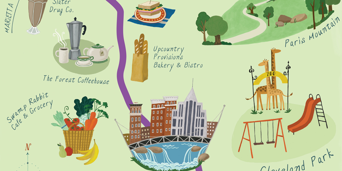
Each location needed a special icon that represented its unique services and attributes. Time is always a constraint with editorial turn around, so I didn’t have the luxury of personally seeing places I wasn’t already familiar with. But it was a lot of fun virtually “visiting” each enterprise’s web site and discovering what it had to offer. I wanted each location’s icon to have a very hand-made look to it, so instead of drawing directly onto the computer, each icon was free-handed (just on plain printer paper- one of my most used and favorite sketching surfaces!) scanned it in, and then traced over it in Photoshop with the paint tool (as a separate layer – that way, the original drawing could be deleted). The result was something like this:
And so on…..
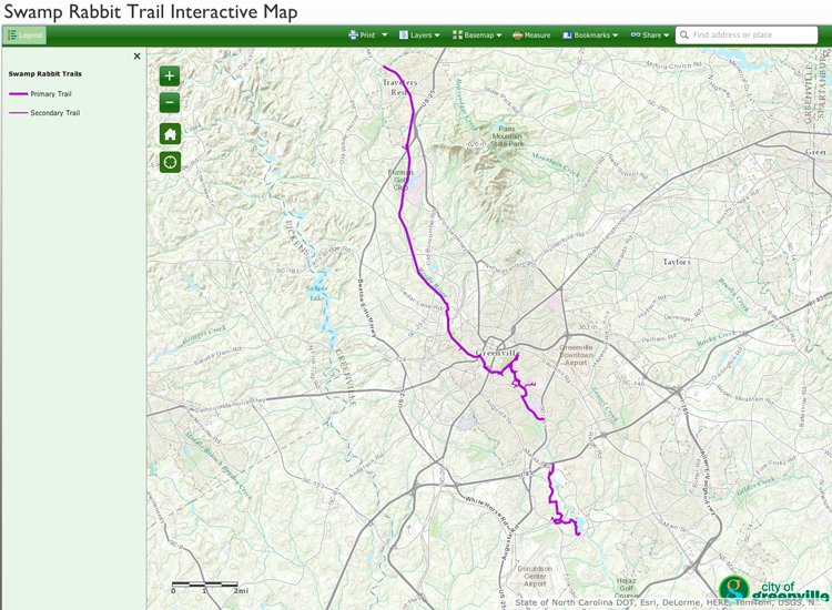
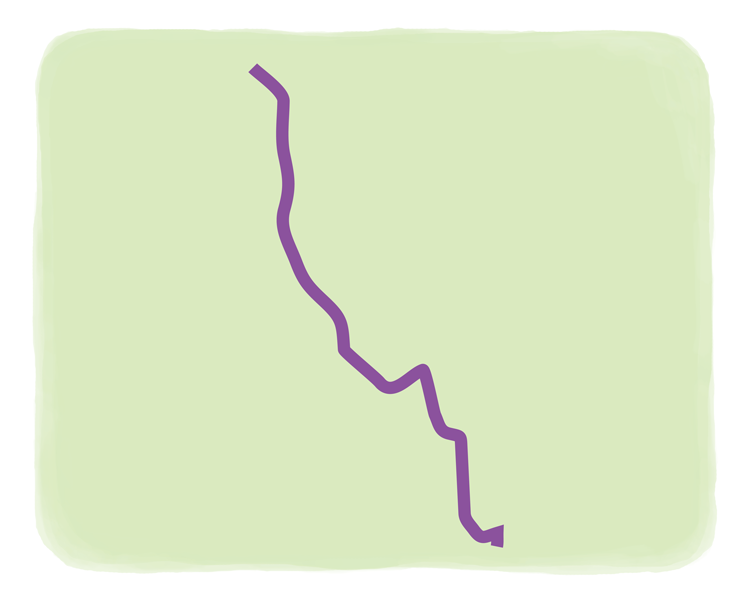
Next task was to add the actual trail. It needed to be accurate, but also a hand-made representation. Thanks to Greenville County Rec‘s interactive map of the trail, the perfect model presented:
I liked the way the bright purple stood out against the earth tones, so I picked a similar bright purple to work against the green foundation I had chosen. The trail had to be simplified somewhat but still have those organic angles. This was traced and simplified in Illustrator then imported as a smart object into Photoshop:
Each icon had been created in its own layer, which allowed me to move them around individually. The interactive map had a feature that allowed me to type in the address of each location and view it in relation to the trail. That gave me the basic vicinity for placement.
The next layer was choosing typeface. Thanks to MyFonts I chose one that represented the hand-letter quality to work with the image….