We’ve been talking a lot about personal space this year….6 feet apart, quarantine, masks, face shields. How physically close do we need to be to feel connected? How much physical distance does it take before we start feeling alone and isolated?
It’s kind of fitting this piece is called “Space.” A silhouette drawing is mainly about space. The positive space, the negative space, how our brains sort out that space when color is added as a third component to the black and white. Whenever I create any illustration I think of the space in terms of threes (fore-ground, middle-ground, back-ground). These elements are primarily connected to my roots in the theatre (downstage, centerstage, upstage). I think of prosceniums, layers of objects lying in space like a pop-up book, giving us the illusion of distance, when we do not have the reality of that distance.
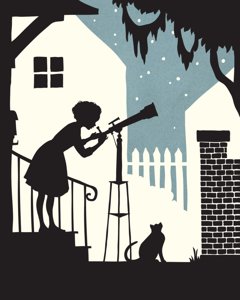
When silhouetting in only black (using the white space as the negative space) there is only upstage and downstage – no middle-ground, or centerstage. It is only about the subjects, the action. But in adding a third color, you can add a third space.
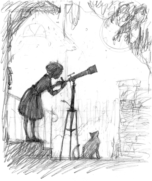
1. Black/darkest color should always be the foreground – the main subject, and where the action lies. I start here first with a sketch:
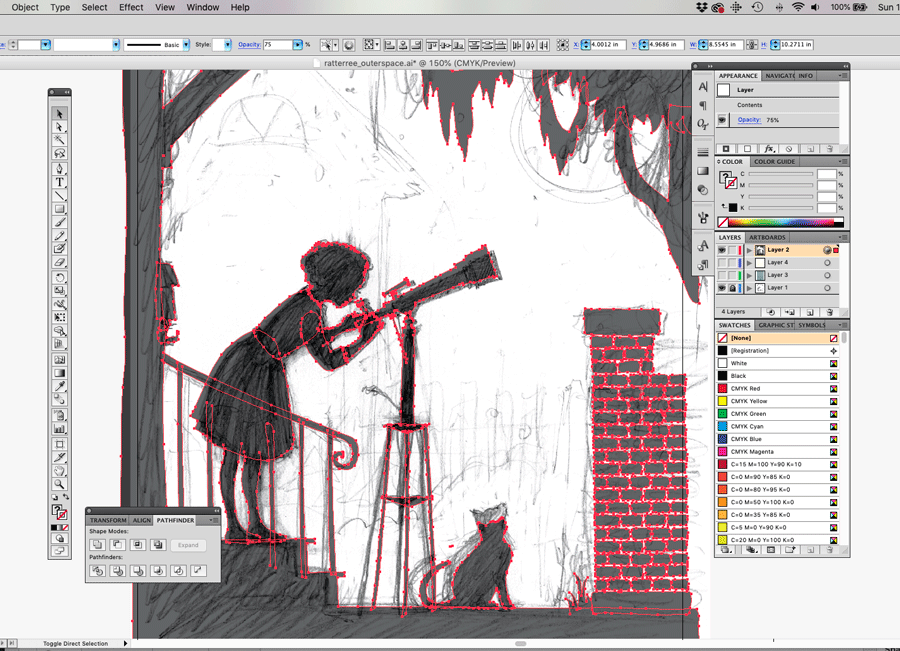
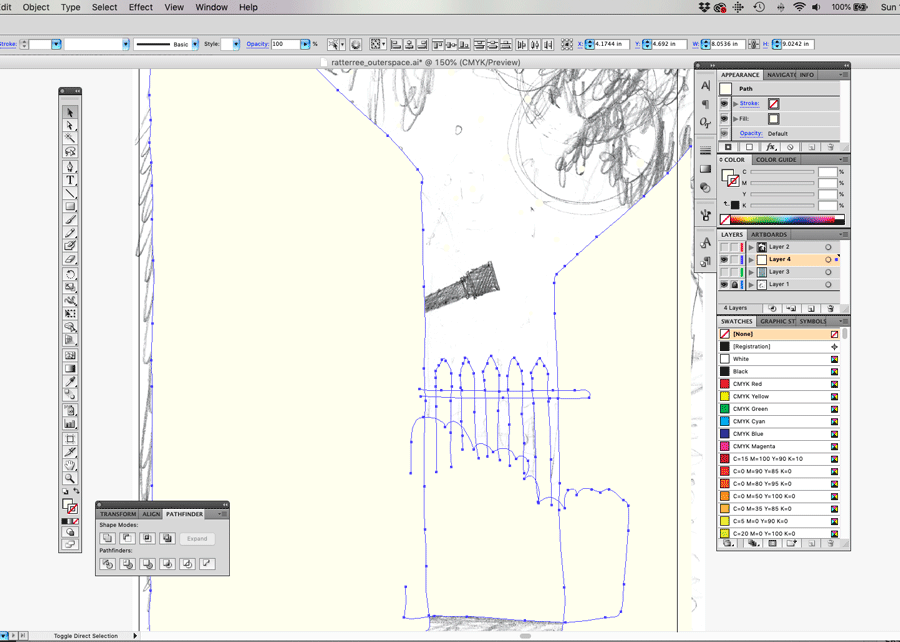
2. While I had a general idea of the middle and background information, I needed to first formalize the main drawing first. I achieved the smooth solid black color by importing into Adobe Illustrator and tracing my sketch as solid objects:
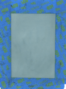
3. Once I have the main drawing set, I start adding the space behind her. Beginning with the farthest distance first, which I knew I wanted to be a deep blue color (but it couldn’t be too deep and compete with the silhouette). I had a small swatch of watercolor-painted paper in my studio that I scanned (I like to keep a few of these on hand in my work space. You never know when they will come in handy!)
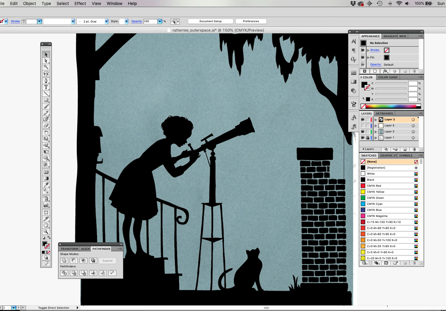
4. I return to my original drawing layer and work only on the middleground as a new layer (I disable the other layers so I can focus only on the houses)
5. The final touch: adding the window was the final element that brought it all together. Even though the squares are black (like the fore-ground) they still seem to recede and stay a part of the middle-ground. Don’t ask me the science behind that – there certainly are others much more qualified than I who can explain it, but I’ll use it.
Have fun playing around with color this week, and discovering how it creates space. Share your experience with me on Instagram by tagging @aliceratterree
Happy art making!

