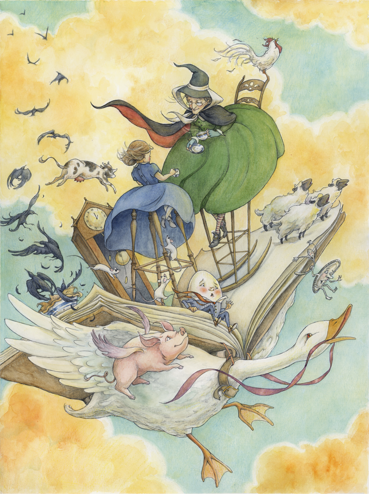
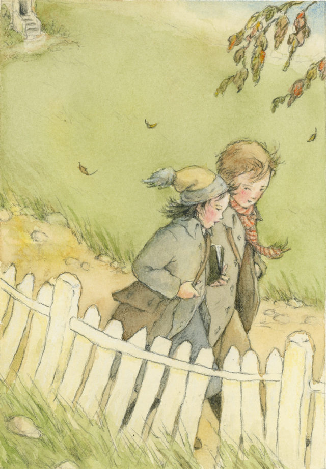
The idea of students walking to school probably brings into mind the old cliché stories of our grandparents – “When I was your age, I used to walk 5 miles to school in the snow!” (That gap between home and school proudly growing larger each time the tale is delivered) We may also regard walking to school as something archaic and “old fashioned” (imagine Laura and Mary Ingles trotting down a sun-dappled dirt path swinging books neatly buckled with a leather strap).
I myself never walked to school. Carpooling in a large station wagon was how my friends and I got around. Then about ten years ago I moved to Greenville to a neighborhood with an elementary school nestled only two blocks away. On the first day of my son’s first grade year, we walked.
We saw a bunny.
We listened to birds.
Watched the way the leaves changed color throughout the year.
We talked to other kids, other parents.
Strangers became friends.
My children are older now, but I still see others buddying up and walking up that hill, their crowns sweetly tilted inward as they talk. I’m confident they will have much better stories to tell about walking to school when they are grandparents.
Happy Earth Day.
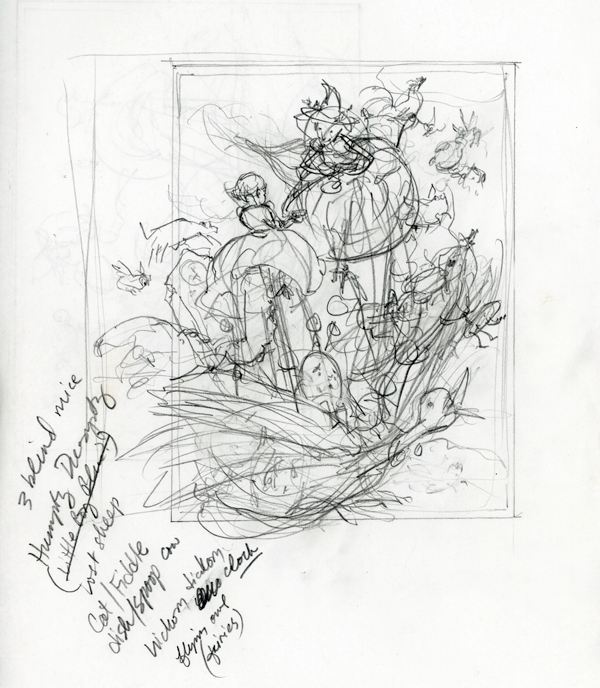
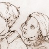
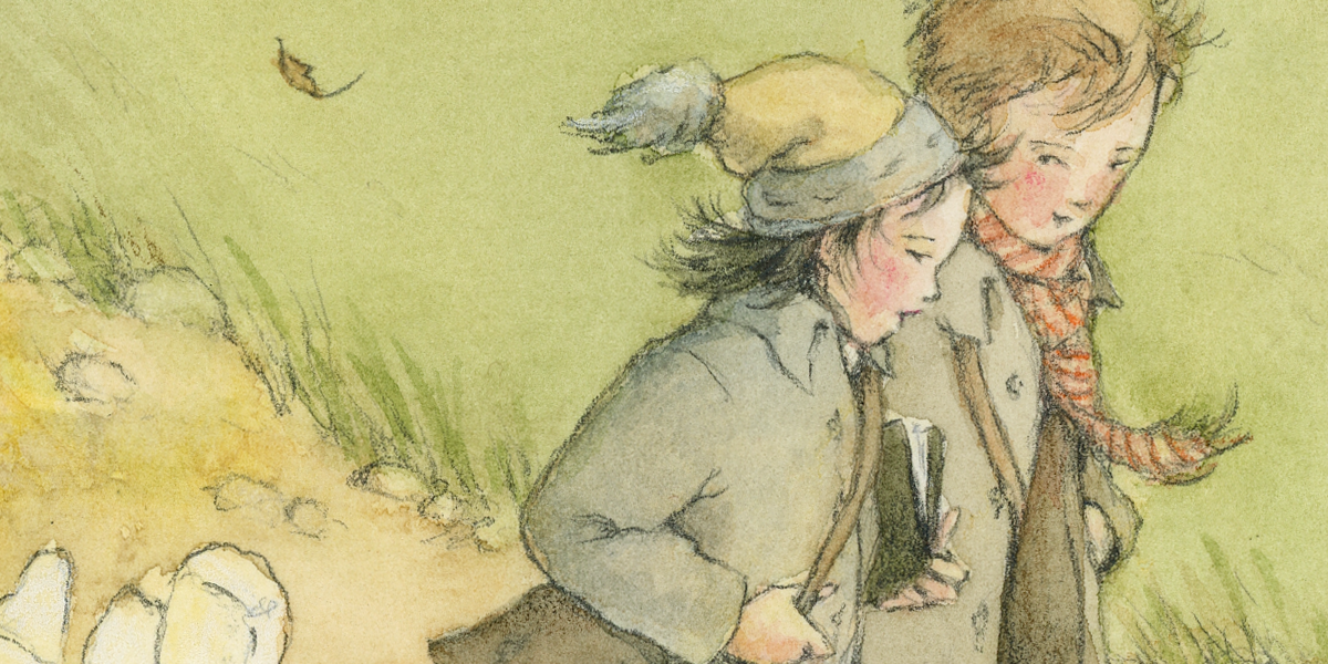
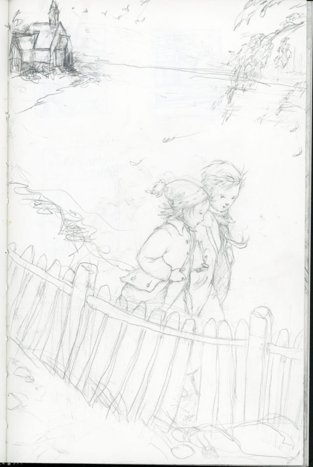
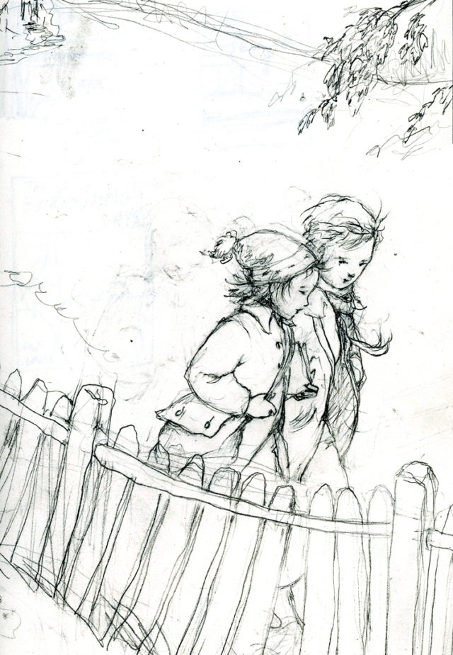
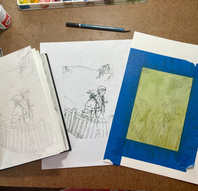
In this painting, I drew inspiration from this life memory….it starts with the sketchbook:
Sketchbook page (Usually worked on in the carpool line of my daughter’s after-school program)The sketch is scanned and cropped, then levels intensified (in Photoshop) for better visibility when transferring. I then print this out.
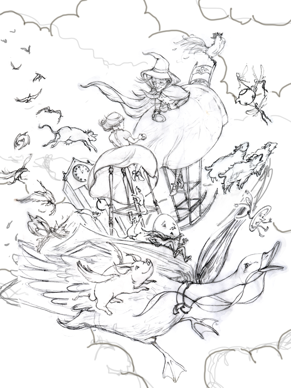
I use an Artograph Light Pad I bought from Michaels (if you pay attention to the coupon savings, you can get these for half the cost!) Place the printed copy of the sketch onto the light pad, and watercolor paper on top. Then trace for a fresh drawing. (Side note: I love listening to podcasts during this phase. One of my very favorites: 99% invisible from Radiotopia. If you haven’t heard of it, carve out 20 minutes today to start enjoying. Hours of discovery awaits you! You can also browse other amazing Radiotopia shows like Criminal, and The Truth)
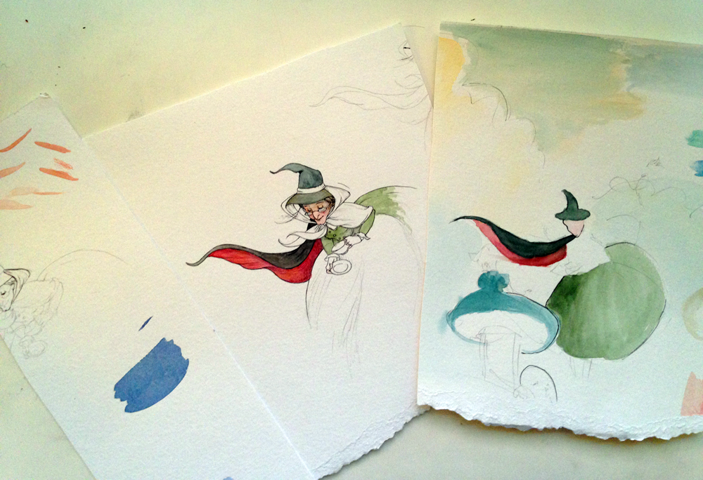
The art table at a glance…
The process… *note: the watercolor paper washed in green was a first pass/practice on a monochrome surface (I usually keep test washes laying around and draw/paint on top of them for fun) I repeated the process with a clean piece of watercolor paper and added color (see final below)
Then begins the really fun part: bringing it to life with more definition and color….
If you are into girl power, then it doesn’t get any better than Jane Addams. I shamefully admit that I knew very little of this renegade change agent before author Suzanne Slade’s manuscript, Dangerous Jane (2017, Peachtree Publishers), landed in my studio, and I will forever be thankful she has come into my life.
For those of you who are trying to dig through memories of high school history class, Jane is widely considered the “mother” of social work. Born in 1860, Jane grew up in a family was of substantial means and social status (her father John Huy Addams was a successful businessman and active republican party senator, sharing a personal friendship with Abraham Lincoln). Yet despite living during a time when women were expected to politely follow a traditional path, Jane brushed off these conventional ideas to blaze a trail of her own in social reform, founding Hull House with Ellen Starr in Chicago in 1889 – our nation’s first ever settlement house. As if that’s not enough of a life’s mission, she became the first female president of the National Conference of Social Work, was co-founder of the ACLU, established the National Federation of Settlements and served as president of the Women’s International League for Peace and Freedom. Oh and by the way, she also won a medal called the Nobel Peace Prize (the first girl in our country to achieve that)!
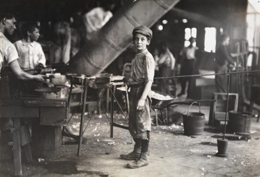
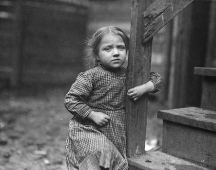
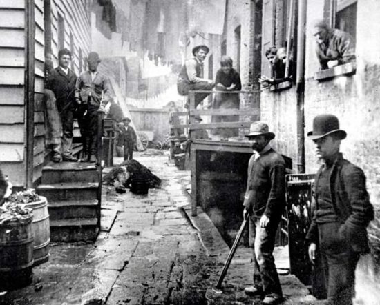
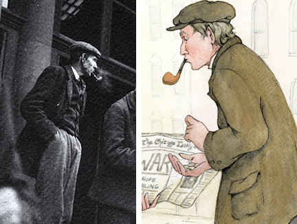
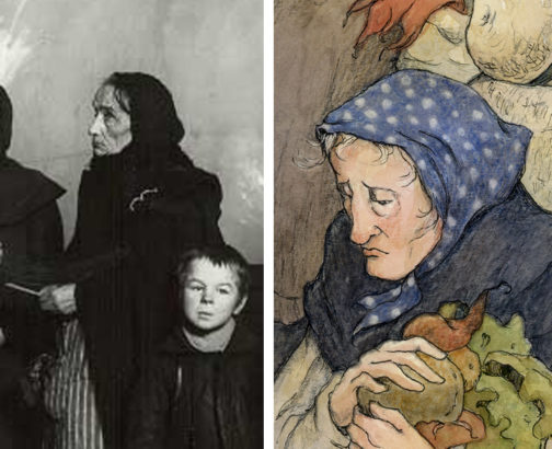
So when tasked with illustrating the account of this woman’s life, naturally I very much felt a sense of responsibility to honor her legacy. It was vital I do a lot of visual research of the real people and places to refer to. Thankfully there is an abundance of photography of the immigrant population at the time. In addition to social activists like Jane, the world of photography was experiencing a similar movement exposing the grittier aspects of society – tackling issues of poverty, child labor and other social injustices with dynamic an emotionally moving images.
Boy in a glass factory (ca. 1890), Jacob A. RiisTenement Child Near Hull House, Lewis HineBandit’s Roost, Mulberry Street (1888), Jacob Riis
I pasted many of these characters up on my studio walls so I could just live with them throughout the process.
From this abundant pool of people I had the perfect “casting call.” Each time I found a person that spoke to me through these photographs, he/she would become a character in the book.
The same went for spaces. These dilapidated environments of Chicago’s poorest neighborhoods were helpful in creating the scene when Jane encountered poverty.
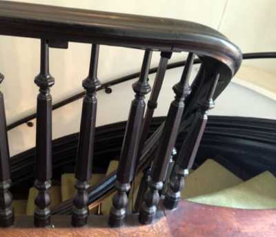
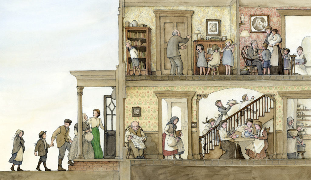
Depicting the Hull House seemed especially intimidating, mainly because this home still stands today as a museum on the campus of University of Illinois Chicago. So I made a point to visit the museum and walk the halls and grounds. Nothing ever conveys the feeling of what it’s like to physically be there, to hear the echoes in the halls or the sound of the old staircase as I walked up and down, the smell of the old wood, and the smallest details.
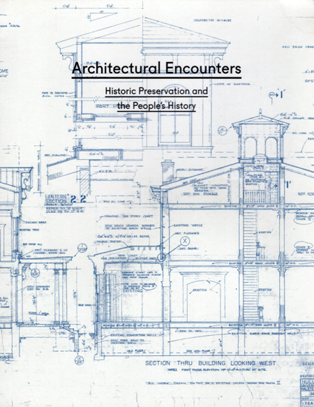
While I was at the Hull House museum gift shop, I encountered a book that immediately caught my attention – Architectural Encounters: Historic Preservation and the People’s History. The cover caught my eye with the blueprint renderings of the house and immediately me inspired to utilize this information into the Hull House spread.
I did not hesitate to pick up the book and buy it – just for the cover alone, but unfortunately the book didn’t offer all the angles and details I wanted. So I went in search of the original blueprints of the home through the university. UIC’s Office of Planning and Special Collections & University Archives were of great help – they were so gracious assisting me and providing me with an abundant supply of additional images! Here are just a few examples:
One of the most striking aspects to me was the beautiful wallpapers of William Morris that adorned many of the walls. Jane’s bedroom, lovingly preserved in its original state, was so striking with the its design by William Morris’ daughter, May Morris. This welcoming room convinced me that green should be her signature color throughout the book.
In fact, many of the Morris illustrations ended up serving as inspiration for the aesthetics and color palette of the book.
As I now take down the photos on my walls, I’m shocked at how melancholy it is to finish a book and have to move forward. You live with these characters and they become a part of your life for a brief intense time, then quietly and unceremoniously drift away. Like the way Richard Parker leaves Pi stranded on the beach in that beautiful novel, Life of Pi. But there is great comfort and pride in knowing they will go out into the world and live forever.
I’m so thankful to Peachtree Publishers, who believed in me, and to Suzanne Slade for her brave decision to shine a spotlight on this unsung hero – especially now, when our world desperately needs more Dangerous Janes. In honor of her release, I’ve asked Suzanne to share this blog with me by answering a few questions:
__________________
1) There aren’t many picture books out there about Jane Addams and so this will be the first time many young readers are introduced to this brave woman. What do you hope children will gain from learning about Jane’s life?
Surprisingly, there wasn’t a single picture book about Jane Addams when I began working on Dangerous Jane in 2013. Since then, only one picture book has released, The House That Jane Built, which shares how Jane co-founded Hull House.
Right from the start of this project, I knew I wanted to share Jane’s tireless fight for peace, in addition to her work at Hull House. I thought it was important to highlight her peace work because it seemed most young readers and adults didn’t know about her incredible contributions to world peace, and the fact that she was the first American woman to win the Nobel Peace Prize. I also wanted to share how she was harassed and rejected (and ironically named “the Most Dangerous Woman in America”) for simply helping people — all people in need. In Jane’s day (and unfortunately now), society treated people of certain backgrounds/religious beliefs as “less than,” but Jane knew every person was important and valuable. At Hull House she helped people from various backgrounds get along and respect one another, which strengthened her conviction that people from various nations around the world could successfully live in peace too. So to answer your question, my greatest hope is that Dangerous Jane will help readers realize that diversity and differences make the world a beautiful, exciting place, and that we should all do our best to live at peace with each other.
2) As a writer, there’s a certain amount of faith and “letting go” to hand over a manuscript to an illustrator. What quality(ies) do value most in an artist to bring your stories to life?
Actually, it’s never felt like “letting go” with any of my books. It feels more like a long-awaited “moving forward”, because up to that point the story has only been black and white words. So it’s always exciting when an illustrator joins the project to finally turn the words into a real book.
Since most of my books are nonfiction (except one so far), I value working with an illustrator who digs deep into research so that the illustrations not only bring color, life, and energy to the characters and story, but they also present the correct factual details. Speaking of which, I’m so grateful for the painstaking, in-depth research you did Alice! I can only imagine how daunting this process must have been with field trips, photo researching, interviews, etc. Your hard work and attention to detail is so evident in the scenery, clothing, hairstyles, Hull House rooms, and even the accurate newspaper headlines (and so much more!)
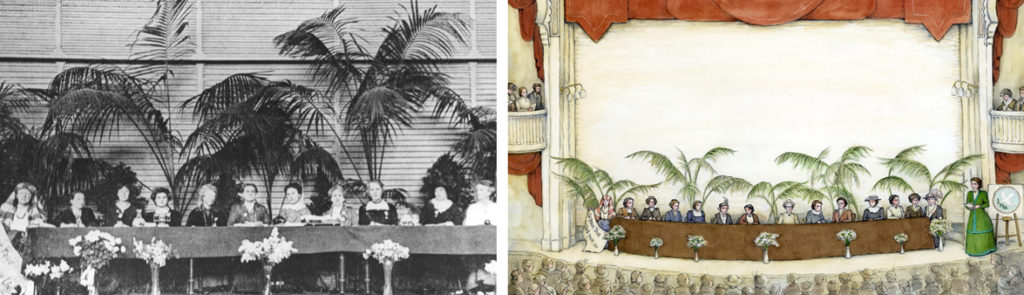
For example, it was so clever how you created the illustration of Jane leading the International Congress of Women in the Netherlands from a photo of that historic event in 1915. FYI, I’m still amazed by that gathering — 1500 women from 12 countries (both warring and neutral nations) worked together to come up with viable, practical ideas to end a war!
3) If Jane Addams invited any three people in history over for dinner, who would they be and why?
This is a really tough question, but I’ll attempt a few guesses. I wonder if Abraham Lincoln might be near the top of Jane’s dinner list. Lincoln was a friend of her father, John, and Jane recalled with great fondness in one of her books about the time her father shared his letter from Lincoln with her. Jane was only five when Lincoln died, so I imagine she’d enjoy chatting with Lincoln about the challenges he faced trying to bring peace during the Civil War, as well as reminisce about her beloved father.
Now if we’re talking about anytime in history, perhaps Jane might like to meet some brave women of the future — women who like Jane, weren’t be afraid to stand up for what they believed in as they worked for peace and helped struggling families. I imagine Jane would have a great time swapping stories and ideas with Malala Yousafzai, Madeleine Rees, Wangari Maathai, Ellen Johnson Sirleaf, Tawakkol Karman, or Leymah Gbowee to name a few.
(During Jane’s adventuresome life she met many remarkable people she admired, such as Leo Tolstoy, John Dewey, Alice Hamilton, women peace delegates from countries around the world, as well as prime ministers, presidents, and even the pope!)
My latest illustration project by author Elise Broach with Henry Holt and Co. will be hitting the shelves on October 11!
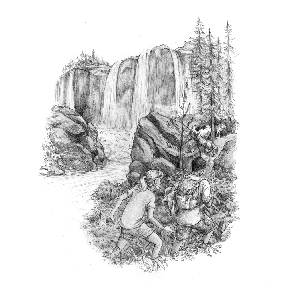
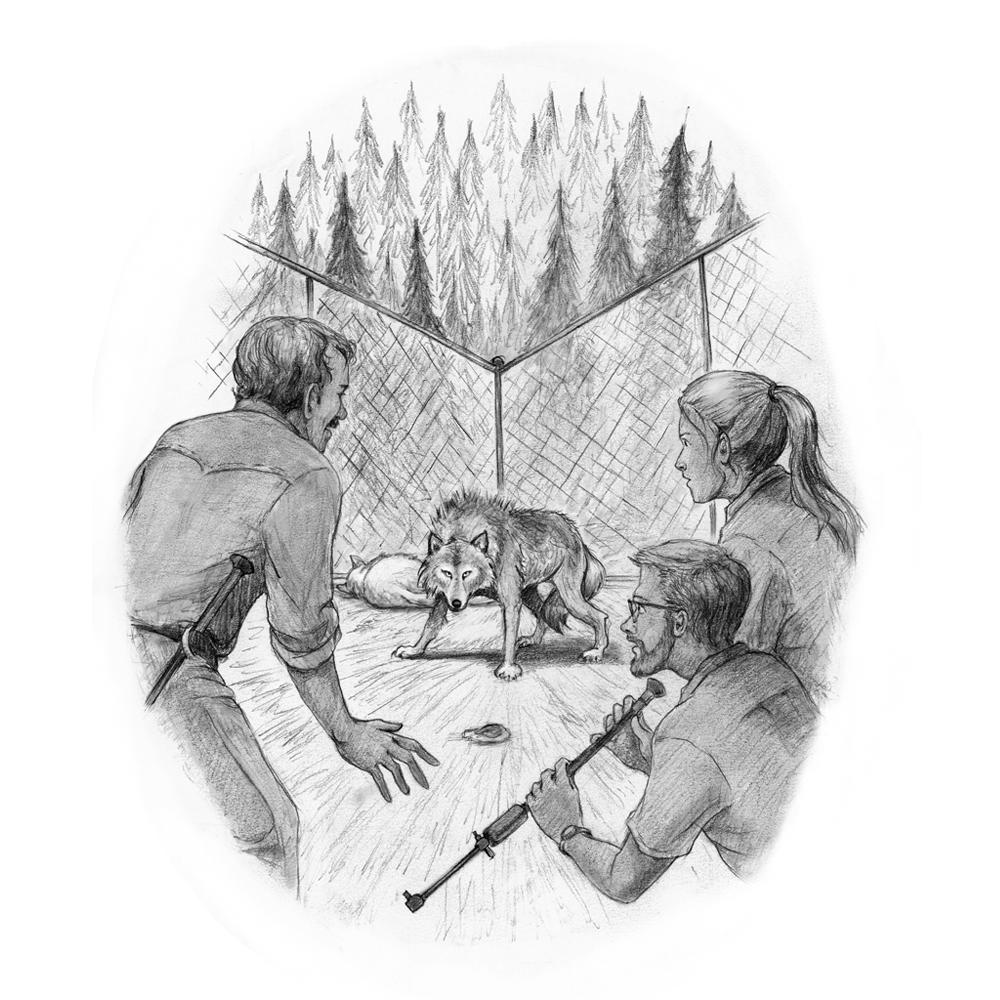
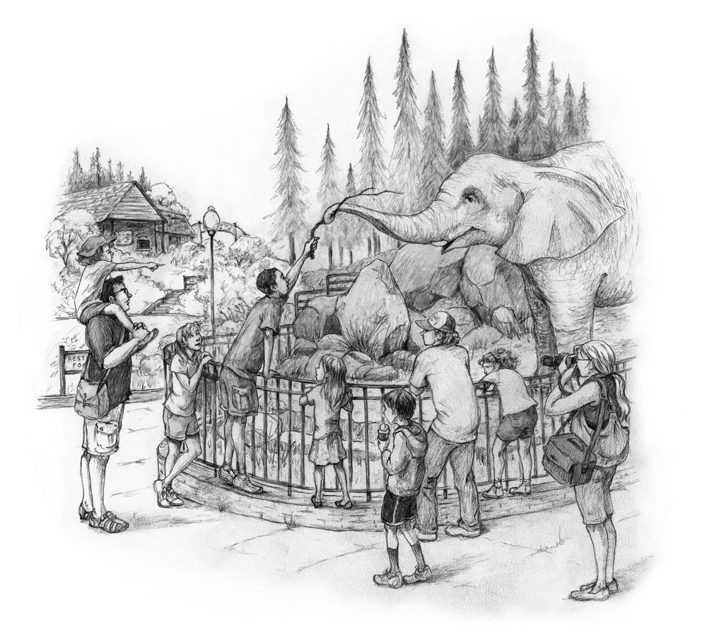
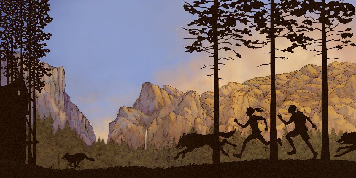
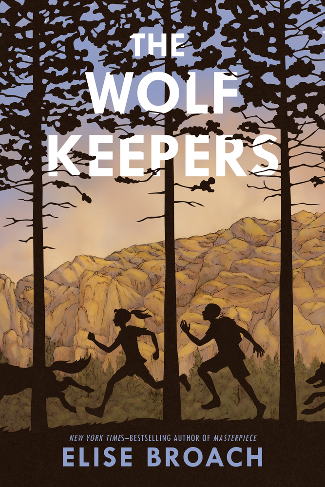
THE WOLF KEEPERS follows the adventures of Lizzie Durango and her new friend Tyler as they uncover a mysterious illness plaguing the wolves at her father’s zoo. In keeping with the tradition of many of her novels, Broach expertly underscores an exciting work of fiction with historical fact. The life and teachings of John Muir weaves through the narrative, impressing upon the young reader the wonders of the natural world.
So many of the scenes were fun to create, but by far my favorite part was tackling the iconic El Capitan and Bridalveil Fall on the wrap-around cover. One thing that struck me was how light and color play on these magnificent rock formations. It was also important to communicate within the wrap the passing of time by transitioning from daytime on the front to twilight on the back – echoing Lizzie and Tyler’s overnight adventure into the heart of Yosemite.
Here are some of my other favorite moments from the story:
What reviewers are saying about The Wolf Keepers….
Publisher’s Weekly (starred review) “Broach’s intrepid protagonists engage in sleuthing expeditions—moments Ratterree captures in evocative pencil illustrations of human interactions with the natural world. . . A gratifying, thought-provoking tale.”
Kirkus Reviews “Despite the fast pace of [this] adventure—which climaxes in a harrowing 48 hours alone together at Yosemite—the text includes plenty of philosophical questions about animal rights and relationships of all kinds. Tyler’s wry comments about his race add further dimensions to a thoughtful, well-told tale, as do the pencil drawings. John Muir’s spirit hums along under a well-developed plot with likable characters.”
Booklist “Part friendship story, part mystery, and part survival adventure, this engaging book makes the most of its two unusual settings. Fans of Broach’s Superstition Mountain trilogy will want to try her latest, with its western locale and intriguing jacket illustration.”
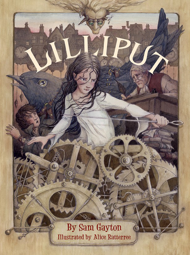
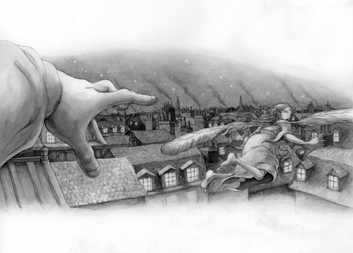
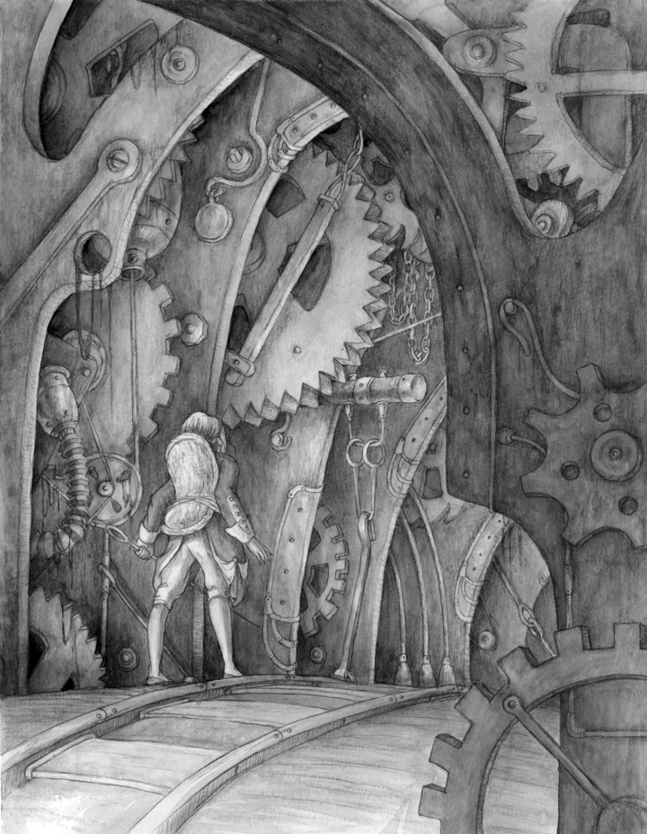
This weekend marks the birthday of LILLIPUT written by Sam Gayton, published by Peachtree Publishers!
A thrilling sequel to Swift’s Gulliver’s Travels, this mid-grade novel is certain to capture young readers, introducing them to the fantasy genre while paying homage to a beloved classic. It was so much fun creating the cover and interior illustrations. I immediately fell in love with main character Lily’s brave spirit, and was swept away by the 18th-century London setting, from the buckled shoes to haunting rooftops. My gratitude goes out to Sam for his inspiring words, and to Stephanie Fretwell-Hill and Nicola Simmonds Carmack for their support with art direction and design.
For those of you in the NYC area, Sam will be at the Bank Street Library (5th floor, Salon #2) on Friday August 7 from 5:00-6:30 PM to discuss Lilliput! For more details, visit: http://www.bankstreet.edu/events/details/460/
Here is a sneak peek of a few of the many exciting scenes in LILLIPUT. (For an inside look into the process of creating the illustrations, check out my recent post for Peachtree’s Publishers.)
One of my favorite annual events is Metropolitan Arts Council‘s “Flat Out Under Pressure” (FOUP) contest. In its fifth year, this program intertwines visual arts and sound environmental practices in downtown Greenville. FOUP provides eight recycling bins for paper, plastic and glass in various locations along Main Street, encouraging recycling among pedestrians while creating a different exhibiting opportunity for visual artists.
The event, which took place this year at the end of June, begins with a 24-hour art-making juried competition. Each participant comes to the MAC office to have their surfaces officially stamped.
my stamped blank surface ready to go! 9:00 am, June 27, 2014
Artists may stamp as many surfaces as they like, but only one can return within 24 hours as an official submitted work of art. Once returned, the pieces are then juried that afternoon with an awards reception held in the evening. In addition to receiving cash prizes, selected winners have the opportunity to choose two images of their work for reproduction on the downtown recycling bins. 1st place winner even gets a week-long trip to Italy to stay in the beautiful Villa Sant’ Andrea! (Here’s to hoping for that one someday) The show is displayed in the MAC Gallery throughout the month of July.
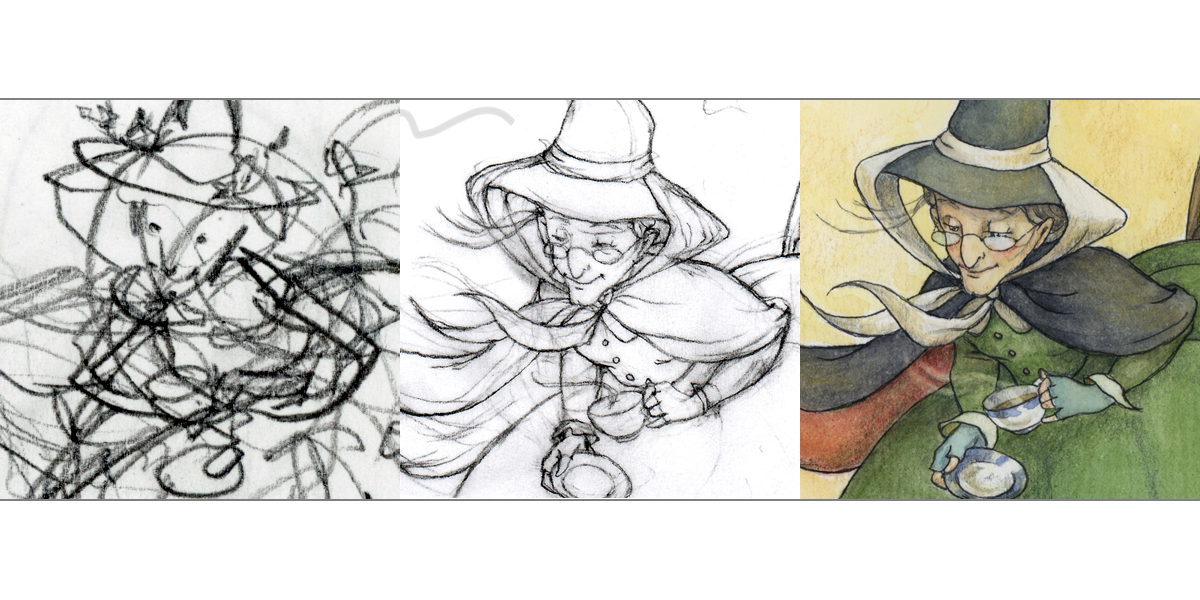
So for the process: How to prepare for having only 24 hours to create a finished work of art?
It began with a thumbnail:
mother goose brainstorming
To keep the energy of the thumbnail, I scanned imported to Photoshop and then increased size of the thumbnail which was roughly 6″ by about 7.5″ to fit the paper I would use, 12×16″ – so about a 200% increase.
I then used tracing paper to trace the thumbnail and add detail…
adding detail from thumbnail using tracing paper
Since I didn’t have tracing paper that was 12×16″ each figure or group of figures was worked on separately. I then scanned them into Photoshop and added each image carefully over the original thumbnail file in a separate layer. The result was a “final” sketch compilation:
“final” sketch of compiled scans in Photoshop
This was printed out to scale (took about 4 sheets of ltr paper, which I pasted together) All of this was prepped and ready to go before the event. The evening before the event I had fun transferring a few sections and working with the color palette.
color and line practice before the big event.
So once I had my surface stamped, I was able to promptly bring it home, and have a full 24 hours to transfer the sketch using a light box, ink and paint it. 24 hours goes by pretty fast even when you pull an all-nighter!
I usually like to feature an illustrator for every blog post, but today I have several. The following illustrators were selected for the annual SCBWI mentorship program. Take a moment to check out their amazing work!
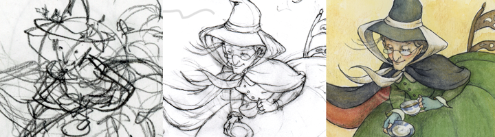
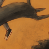
“Who’s afraid of the dark?” illustration by Alice Ratterree
You know that 5 minute window before you actually wake up and are a bit lucid, but still kind of dreaming too? Well, this is a result of that state, the season, and perhaps also as an homage to the dark children’s books frequently produced by French publishers, which I am continuously fascinated by. Take a look at some of these titles to soothe your little one to sleep:
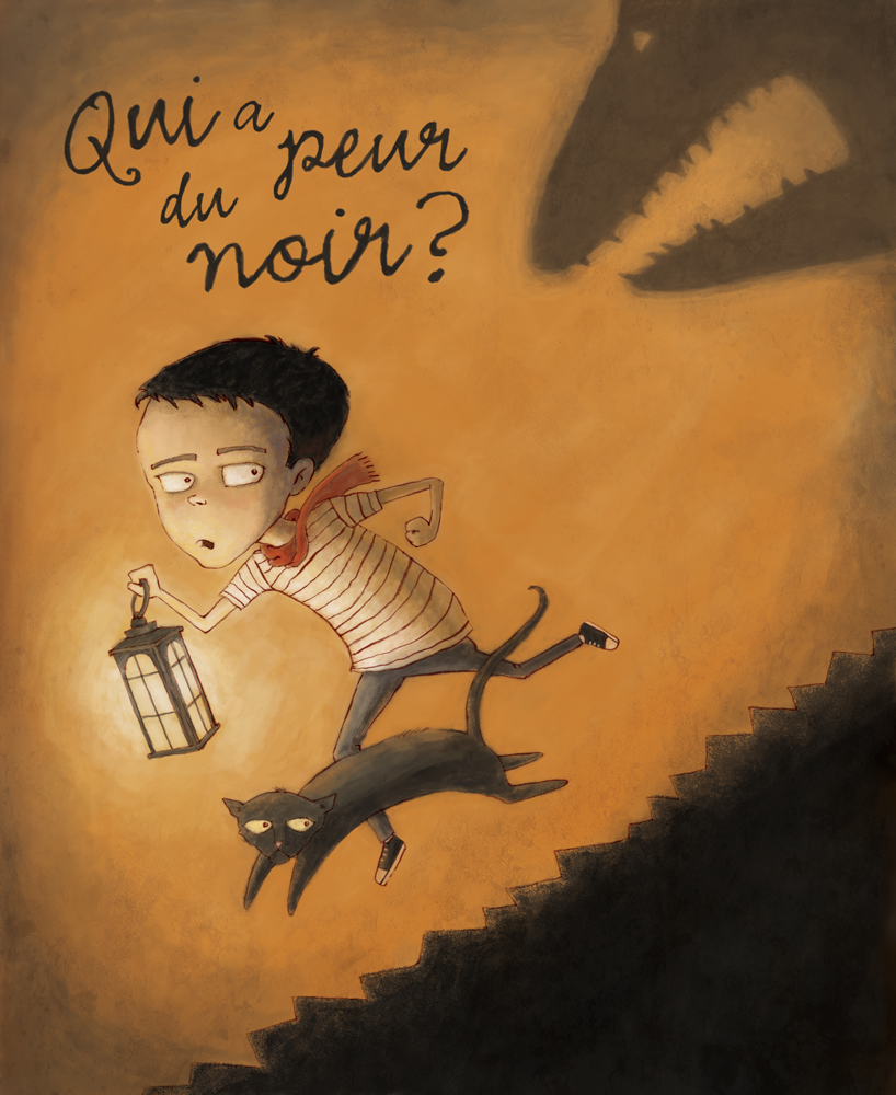
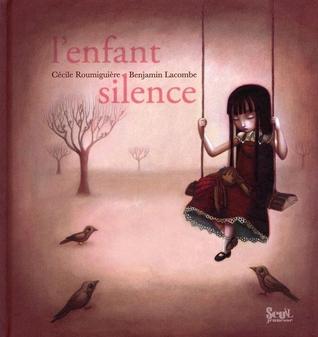
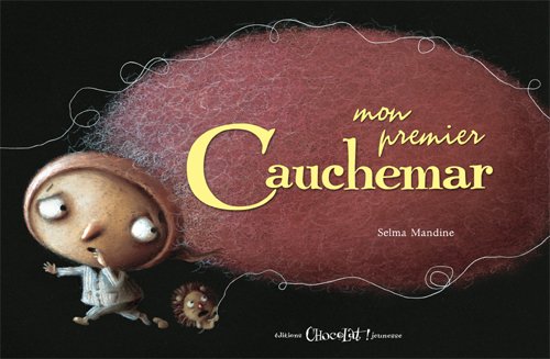
“The weight of grief” illustration by Roxanne Marie Galliez“The silent child” illustration by Benjamin Lacombe“My first nightmare” illustration by Mandine Selma
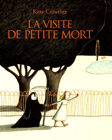
And my personal favorite,
“The visit of little death” illustration by Kitty Crowther
This past weekend, SCBWI Carolinas celebrated their 20th annual conference in Charlotte, NC. I love returning to the well. Inspiring keynotes and energizing breakouts filled our time for three whole days! Illustrators arrived early on Friday for an intensive session with the charming illustrator Priscilla Burris. We were given an assignment ahead of time which was:
Characters Page: Create and develop two characters. Name them.
Main Image: Create and Color Finish an image involving both characters, interacting. (Either one page or 2-pg spread)
Before Image: Create and Sketch an image that shows what happened before the Main Image part of the story.
After Image: Create and Sketch an image that shows what happens after the Main Image part of the story.
Daunting to say the least. No restrictions, not even dimensions. Wide open. I have to admit, when I received this challenge, I was rather disappointed, and frankly had a bad attitude. I wanted something to work with. Please oh please don’t leave me alone in the dark recesses of my shallow creativity to make something completely original! I felt like I was suddenly being asked to write, and I wanted to illustrate! Sadly, I realized that I’ve been relying on someone else’s work to propel me into my work. How was I going to start with a completely blank canvas?
The answer was in creating boundaries. I’ve heard it said that if children are playing in a large field with no fence, they will gather together in a tight radius near the middle and not venture out very far from each other, playing within a very limited space. If, however they are provided a fenced in perimeter, they will utilize all the space for play. I read that Dr. Seuss had only a 225 word list with which to work from in writing Cat in the Hat. Boundaries propel us into creative thinking by forcing us to solve problems. Last year at the convention, writer John Bemis left us with a most inspiring keynote that provided some tools to work with when we are faced with creative blocks. We were all asked to write 20 words, then step back and look at them. What did they say? Where was the common thread? Is there any imagery that comes to mind? Next he shared with us a game that included asking a question, then find a picture (from a magazine or a book). The last step is to connect your question with the image you found. How does the image you found answer your question?
So I decided to play this type of game with my lucid characters I had floating around in my head. I knew I wanted a doll and an owl, but that was where my big idea ended. So I played what I call the “Blind Dictionary” game. This is where you close your eyes and open the dictionary and point. My goal was to find 10 nouns and 10 verbs. Of course I came upon some adjectives and adverbs, but I moved on and didn’t use those. Here were the 10 nouns: (doll and owl I already had), harlequin, thread, hame, factory, kimono, shilling, wheelie, lichen. The 10 verbs were: conspire, spy, twitch, liberate, lick, burn, blow, scoop, retain.Well, I guess that turned out to be only 9, but what resulted was this lush visual material I had now to work with!
So without further ado, meet Commelina:
and her various transformations:
and the clockwork owl, Li:
The illustrated plot sequence:
In the end, I realized I may have some stories to tell after all. If the material is not provided for me, there is material out there if I cut and paste it together and make boundaries. Thank you, Priscilla Burris, and once again, thank you SCBWI!
A tip of the day from Art and Fear, by David Bayles and Ted Orland:
“Fears about artmaking fall into two families: fears about yourself, and fears about your reception by others. In a general way, fears about yourself prevent you from doing your best work, while fears about your reception by others prevent you from doing your own work.”
After a little over a month of Petite Paintings I must step back and make sure I’m staying focused on what it is that I do – illustrate stories. While these little daily exercises have helped me get back into traditional material, free up a bit, and are a nice sense of accomplishment, they are not representing that priority. Completely valuable and of course they will continue as planned (365 days!), but I will no longer be posting these exercises on a daily basis. Monthly posts of P3 will occur around the 7-10 of each month (based on the date I started the project). Instead, daily and weekly blogging will focus on illustrating stories, thereby challenging myself further to remember that priority of daily practice in addition to P3. I say this after taking a hard look in the mirror and facing fear about myself and about my reception by others. Thank you, David and Ted.
Accountability drives the commitment to blogging daily practice. With accountability, I’m driven to make sure the Petite Painting Project keeps moving forward. After all, it’s OUT THERE, not just in my own world….PUBLIC. So here’s the honest truth: I confess and accept that I am human, and P3 will fall by the wayside from time to time. I have to embrace and accept that as part of this process. This week was one of those times. Plenty of excuses and really, no excuses- just life with two small children, lack of drive and inspiration outside of getting my other commissions accomplished, whatever you want to call it. But I must say, that the week “off” was valuable. It gave me time to just think and look around me (and get over beating myself up a little bit for letting P3 take a back seat). I am beginning to feel energy breathing back into my creative core. So from now on, I won’t shy away from embracing a few days of repose and reflection at the end of each month. After each painting is completed, it gets taped up on my kitchen cabinet doors, so I really live with them. I think I’ll take them down, put them away and start new each month.
I began on August 7, 2012. One month has passed and here’s the look back:
Petite Painting Project, month 1
I’m still searching for the link between these little projects and what it is that I do as an illustrator for children, but also remembering not to have anxiety about it. The answer will come over time. And this is about time and growth. These little paintings are simply a way for me to step outside my usual process and subject matter and look at the world around me. It’s a nice break from coming up with entirely imagined original illustrations. Miniature beauty and sweet compositions lie around me every day. I just have to open my mind to see them.


 My latest illustration project by author